Graphic Design

Amir Saidani

I'm a British-Moroccan Graphic Designer based in London.

I was born in the South West of the UK, I studied Communication Design at the Glasgow School of Art, graduating with a BA (Hons) in 2017, with my specialism in Graphic Design. 

In my time since then and when I'm not at the Royal College, I'm a designer for BBC Creative.

Amir Saidani

As a Visual Communicator and Graphic Designer I see myself somewhere between a curator, archiver and facilitator. Archives are often my starting point. I'm fascinated in how we can take the information uncovered within them, and rediscover the ideas contained inside by reimagining them in a different perspective.

My practice spans from the fairly 'traditional' idea of Graphic Design; Editorial, Branding & Typography, bridging over into more 'conceptual' areas. At the crux of both of these styles of practice, that, crucially interact and inform each other, is a focus on the audience, and what they bring with them into the design. In my role as a curator/archiver/facilitator, I give the viewer agency to inform the visual and narrative outcomes, with them being constructed based on their own (and not limited to) political, cultural, socio-economic perspectives.

My work acts as a lens through which the viewer can articulate themselves. A constant question that I ask myself and put at the centre of my work is the ethical responsibilities we have as Communicators, and our roles in ensuring voices are articulated in a fair, just and representative way. Alongside this creating work and conversations that are accessible for as many different viewers as possible, outside the echo chamber of design. In acting as a 'medium' to the idea of design, In my work it's the viewer that constructs the final outcome and imbues the message; not myself.

RCA 2021
RCA 2021 — Banner — Arabic
RCA 2021
RCA 2021 — Manifesto
RCA 2021 — Instagram Story — Arabic, Italian & French
RCA 2021 — Instagram Post — Arabic, Korean & French

The RCA 2021 Identity is an evolution of the WIP identity, building upon our fundamental principles and theories.

Our three core principles remained, however all three evolved to recognise the evolution of the Final Show. Whereas we focused on the motif of experimentation and journeys within the Work in Progress, being represented within the moving 'ribbon'. Final Show is much more about crystallised and realised practice, alongside a celebratory feeling at reaching an exciting stepping stone in the communities creative 'journey'.

These feelings of crystallisation and celebration are represented by the selection of objects, representing items that can be found in our (somewhat more unusual) surroundings, that formulate and influence our practice, collecting, combining and interacting to form new realities. The vibrant colour palette, evolving from the black and white of WIP represents the celebratory nature of the show. These bright and exciting shapes continue to reveal student voices, those that are celebrating what it truly means to be a graduating student at the Royal College of Art, and the feelings, thoughts, trepidations and reflections that go with that.

As was the WIP show, our Final Show and it's existence online was an opportunity, to highlight how international and diverse our institution is, our approach to the identity has been to celebrate, in the face of a changing world, that diversity which makes us so unique.

Democracy in Print
Democracy in Print — Cover
Democracy in Print
Democracy in Print — Internal
Democracy in Print — Full Text

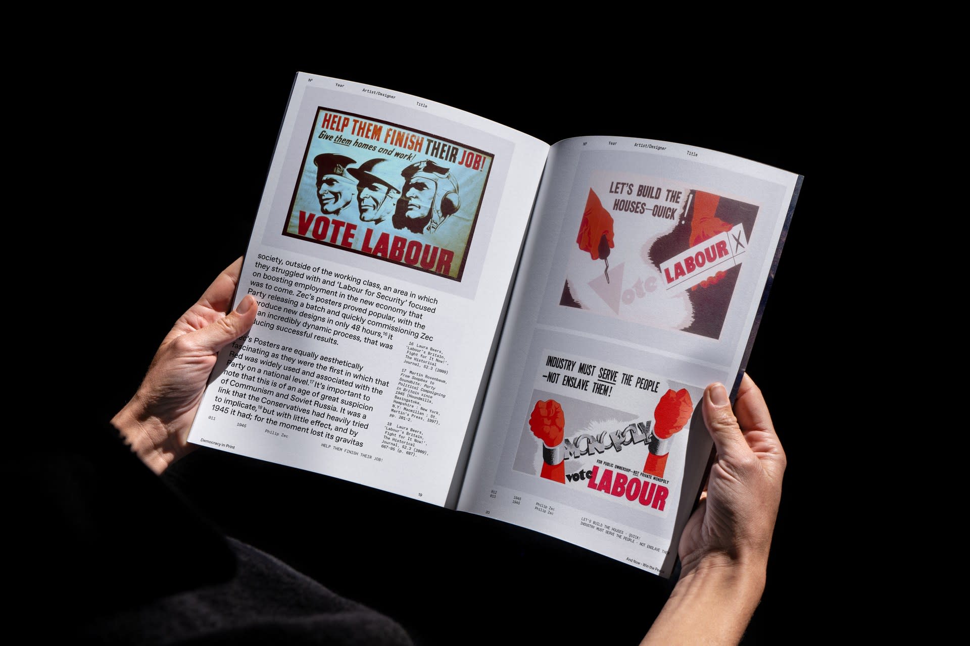
Democracy in Print is an academic essay, examining the Labour Party's design vernacular in the Post-War period, particularly focusing on the medium of the poster.

The editorial design of the work plays as much a part of the analytical qualities of the work as the writing, the piece not only acts as an analysis, but also as an archival process of the works.

The piece was born out of a fascination with the relationship between politics and graphic design, and the questioning of whether political ideologies have clear house styles. The work opened up other fascinating issues to do with the relationship of the Designer, whether the act in a known or unknown capacity, and the role of the viewer within Graphics, and their agency. Key questions that percolate thorough my wider work.


A Fight to the Death
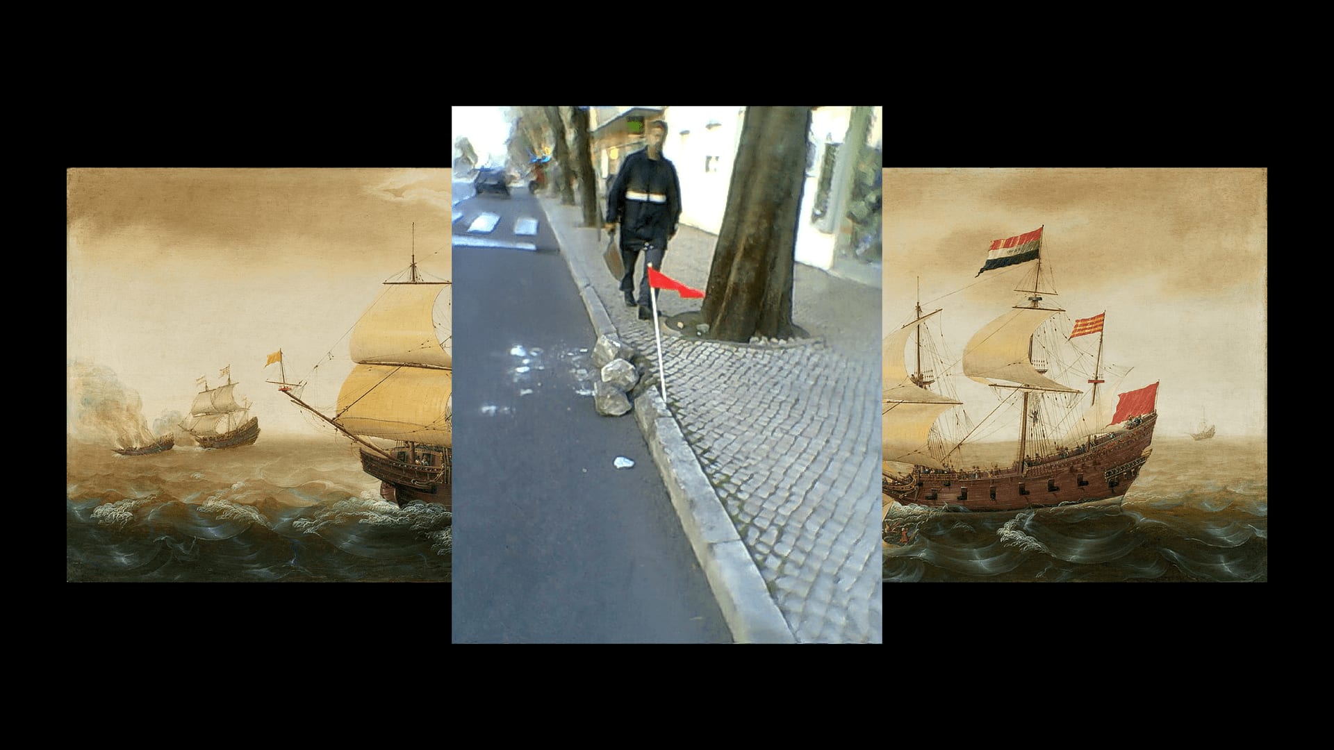
A Fight to the Death — The diverse history of the Red Flag leads to it's multitude of meaning, originally flown as a long thin red banner (Baucans) from ships to signify a fight to the death, as depicted in 'A Naval Encounter between Dutch and Spanish Warships' by Cornelis Verbeeck, is countered by the juxtaposition of a more mundane interpretation (however unintentional), signifying a more contemporary fight to the death.
Lamartine Rejetant le Drapeau Rouge by Felix Philippoteaux (Recoloured Red & Black)
Lamartine Rejetant le Drapeau Rouge by Felix Philippoteaux (Recoloured Red & Black) — The use of the Red Flag in a revolutionary setting is well documented, the French Revolution played a role in reposing the icon of the Red Flag in a Revolutionary and Political context, particularly around ideas of martyrdom.
Shades of Flag (Red)
Shades of Flag (Red) — Documenting the changing shades of the Red flag exhibited on Wikipedia, an exercise in commonality of visual, but also nuance in meaning.
Flag (Red) — Starting at the most relevant Google Image search for Red Flag (Political) the video documents and layers each next step of Red Flag connotations, archiving and collating a range of different visual cues on one subject.
The Anthem of the Red Flag — A piece acknowledging the historic significance, and ironies of the Labour Party Anthem, 'The Red Flag' - reimagined into a national anthem celebrating the Red Flag, using O Tenenbaum, a tune that has a wider classical context as the song O Christmas Tree, and within footballing contexts as well. This piece asks us to think about the common threads that appear and are borrowed within life.

Flag (Red) documents and collates the history and context of the 'Red Flag'. In conducting my research I became fascinated in the meanings we give symbology, and how they can often shift and flex, depending on perspective. 

What is the space in-between an object, that we as humans fill in, how and where does meaning come from, particularly in objects that are so mundane and trivial, how do they transcend their physical form, and mean so much more.

These ideas also branch into exploring what is the scope of a symbol? How can one item that can exist in many different forms still ring true a message to so many people.

How do we adopt, how do we transform, how do we inform the symbols and the objects around us, how can we use the power of meaning and perspective as a tool to shape our surroundings?

These quick and experimental pieces of work document the 'red flag', and its path to infamy, and the many diverse associations and visual cues it has across the world.

WIP 2021
WIP 2021 — Banner — Cantonese
WIP 2021
WIP 2021 — Instagram — English
WIP 2021
WIP 2021 — Instagram — Arabic
WIP 2021
WIP 2021 — Instagram — French
WIP 2021 — Instagram Story
WIP 2021
WIP 2021 — Banner — Mandarin

The WIP 2021 Identity was born out of a recognition of the current 'scenario' we find ourselves in.

For better or for worse we aren't defined by the Royal Colleges usual surroundings, we have been uprooted and now the College transcends the four campuses and finds itself around the world. We are now looking at the world, our work and the college in and from completely new perspectives.

Our new realities are constantly shifting and revealing new perspectives and ideas, this is the crux of the identity of WIP 2021.

Work in Progress is about journeys, experimentation, asking questions, being dynamic, and this idea is represented in the moving 'ribbon'. The ribbon, reacting and interacting with the base identity; the institution, the ideals and similarities that we share; Reveals interpretative translations of what a 'Work in Progress' show means to respective students in their 'mother tongues'.

This WiP show is international and dynamic and the identity embodies these new realities.

The Flag(s) (Red) Constitution
Launch Project
The Flag(s) (Red) Constitution
The Flag(s) (Red)
The Flag(s) (Red)
The Flag(s) (Red) (Antigua & Barbuda and Dominica)
The Flag(s) (Red) (Nepal and Uzbekistan)

The Flag(s) (Red) is a project examining the power of symbology and inferred meaning.

I have been examining the power of the 'Red Flag' - a motif which has transcendent meaning and visual connotations. That stretch from danger, to a heralding of revolution.

The Flag(s) (Red) takes every 'sovereign state' which has an element of Red within its flag, and begins to layer those elements together, to form a collective tapestry of inferred meaning. Presented as a National 'constitution' those inferred meanings, both official and unofficial are listed as a 'crib sheet' for the many diverse and converging meanings.

My interest within this project comes from the power of the similarity, the power of the stories that we tell ourselves, how can we imbue a virtuoso of meaning within something. Our perspectives and background, our pasts and our presents all change and form lenses in which objects are viewed through.