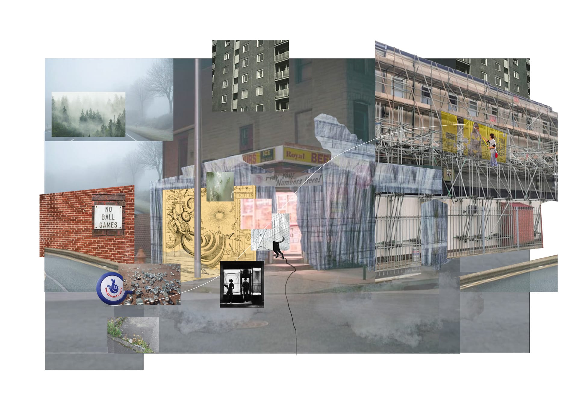
ADS0: Rooms and Windows – Framing the Everyday Catastrophe in a City of Interiors

Paige Stapleton

Paige Stapleton is an Architectural Designer from London. Prior to her time at the RCA, Paige studied at the University of Bath (2015-19) where she gained First Class Honours in BSc Architecture. Paige has worked with architectural practices Hutchinson & Partners (2018-19) in London and Stride Treglown (2017) in Bath. 

Due to the nature of her training and personal interests, Paige hopes to direct her practice towards the intersection of where the scientific meets the ethereal, using the elements as a key part of her material palette, believing in ephemeral architecture that awakens one's senses. 

Paige Stapleton

Awakening from Smoothness

Reactualising the typology of the shopfront as a mechanism to lure, narrate and act as a vehicle for personal reflection. 

Formed simply of a front door, glazed window and advertisement sign, the shopfront is often understood as the necessary enclosure of a place of commerce; more insightful descriptions portray it as the outward representation of brand identity. However, the project argues that this simple device can also be seen as a powerful mechanism to discuss the agency of architectural form. On one side largely unintelligible to its subject, and on the other, as both its mirror and its trap. 

An object of careful scrutiny and calculation, the shopfront is designed to lure and crucially evoke the experience of non-conflicting contiguity, of easiness, of smoothness, marshalling technology to create such an uninterrupted experience. A trap that looks to capture attention and presence into the store, a precious first article of engagement in its economy and an act of deliberation that requires sophisticated understanding and empathy, a revealing closeness. 

The shopfront can be seen as the ultimate trap, its ongoing transience reflecting our endless changes in society through time. If we study the shopfront as a type of architectural trap, we can train ourselves to extract a portrait of the subject that stares at the shopfront itself.

Simultaneously the window is a trap, it is also an object of empathy and reflection, an image that manages to demonstrate an unexpected potential to talk about much larger systems all linked to the current reality of when the photograph was taken. 

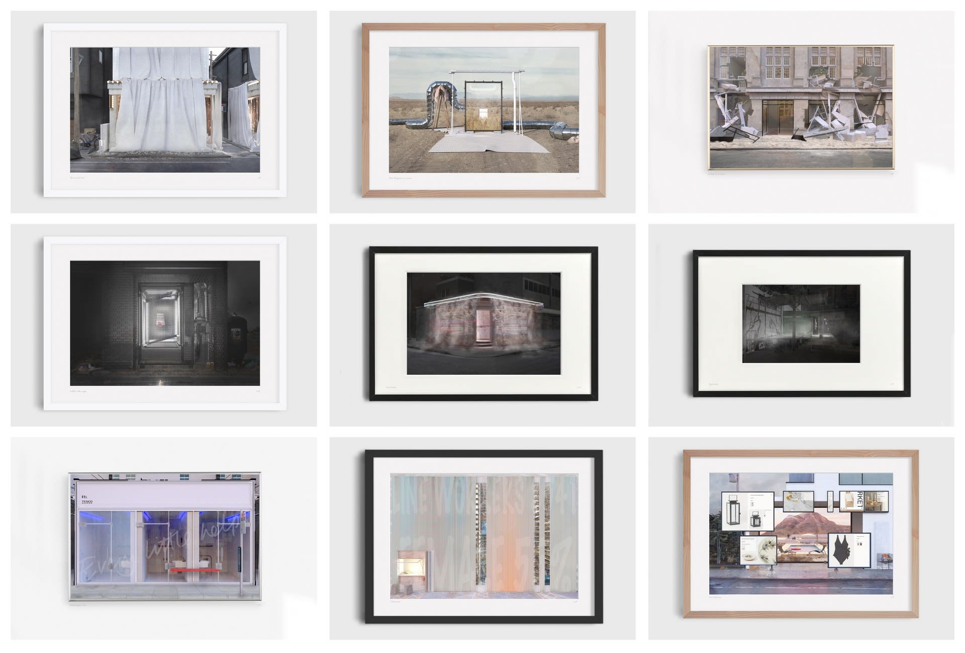
The project examines these dimensions through a series of images, where I explore the shopfront as a project site, to demonstrate its potential and explore its limits. Each shopfront seeks to expose a specific mechanic of the trap, aiming to construct a vocabulary of the form that smoothness operates materially and crucially how it reflects our society and ourselves, not only as consumers, not only as it's designers, but as it's subjects.

Photograph: Stapleton & Sons, My Grandfather's Butchers Shop, Teddington High St.

Awakening from Smoothness
Awakening from Smoothness — Reactualising the typology of the shopfront as a mechanism to lure, narrate and act as a vehicle for personal reflection.
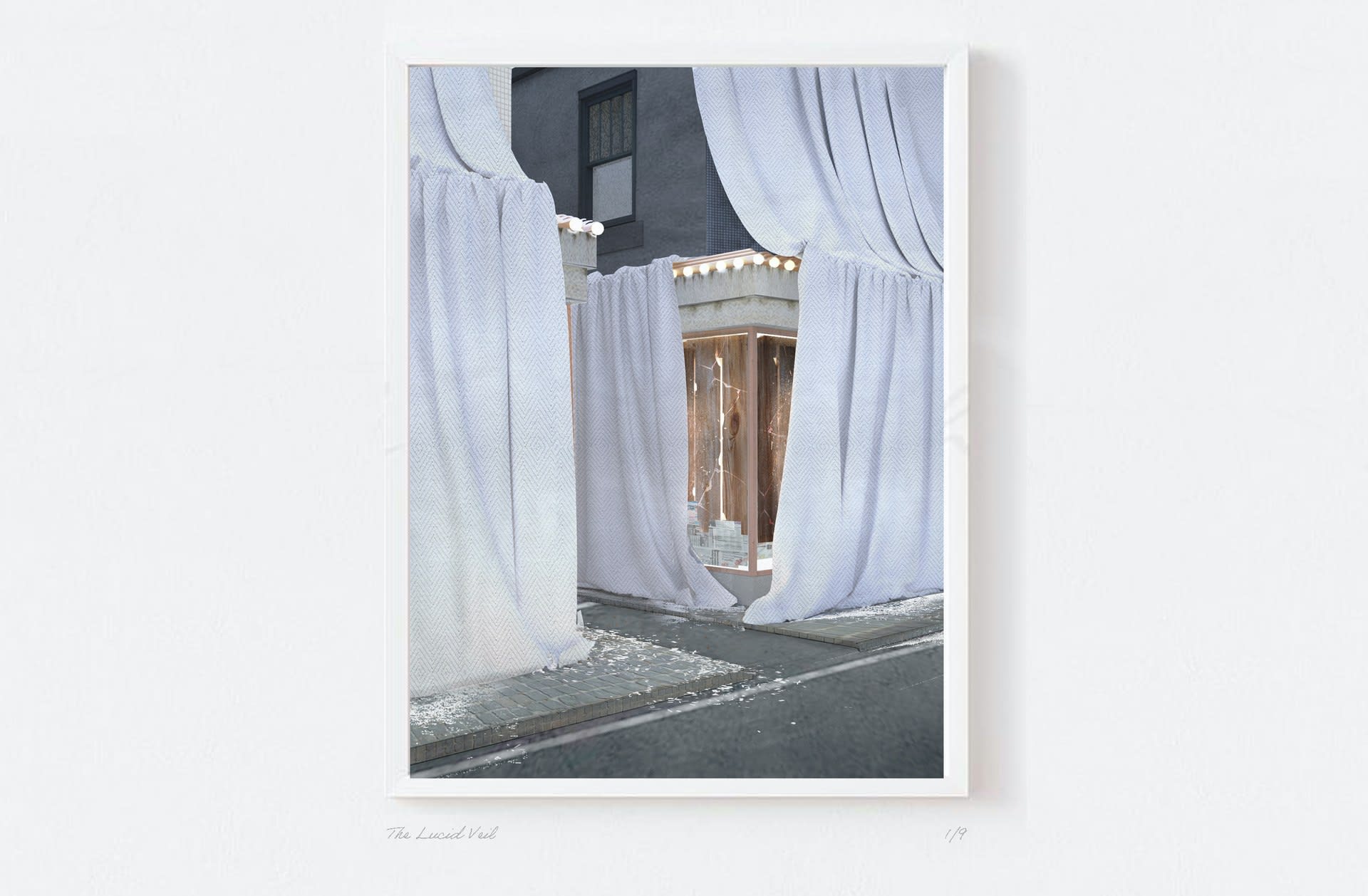
The Lucid Veil
The Lucid Veil — We begin with the Lucid Veil, a shopfront designed to emphasise the art of display, the power of window shopping and the ability to enter without physically entering. In the Lucid Veil, the mechanic of the display window is completely flipped on its head, taking precedent from Christo and the act of covering, it causes viewers to become even more intrigued by what is behind.
The Lucid Veil (2)
The Lucid Veil (2) — Shards of glass demonstrate the display windows influence and impact on the surrounding streetscape.
Fata Morgana (In Reverse)
Fata Morgana (In Reverse) — A shopfront designed to showcase the hidden infrastructure of the shop window. These hidden systems allow it to mediate the extremes of any environment, guaranteeing the ultimate picture window, a spotless finish no matter where in the world.
A Poke & A Kick
A Poke & A Kick — And what about the staging of slowing down. With protruded window profiles and textured external tiles to slow the passer by, A Poke & A Kick takes these mechanics to the extreme, emphasising the ability of the shopfront to steady the pace of the passer, manipulating their movement before they even enter the store.
Will-o’-the-Wisp
Will-o’-the-Wisp — Then there’s the curation of temptation. New products have the ability to feel forever within reach and yet forever vanishing from our grasp. Like a will-o’-the-wisp, it lead us further on the hunt. The urge for conquest can never be sated: the commodity sits radiating on the shelf but, once possessed, it plummets from the realm of the ideal. The shop being the only temple in which its aura can be protected.
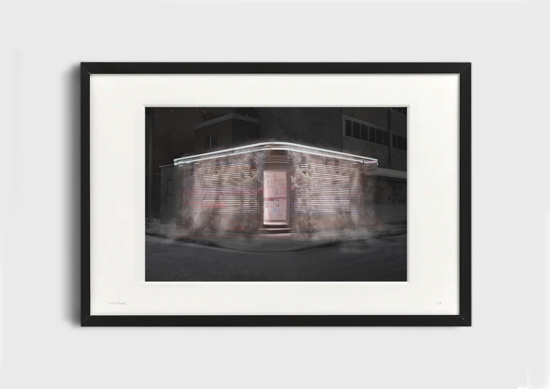
Wet Paint
Wet Paint — In Wet Paint, it explores how the shopfront seeks to seduce human instinct and how sensual materials are deployed to ignite peoples senses. Like fly's naturally attracted to the exposure of light, we as humans are drawn to our own sensualities, finding balance in symmetry, relaxation near water and comfort in warmth. Wet paint explores how the shopfront can be designed to associate a brand with a feeling and not necessarily a product.
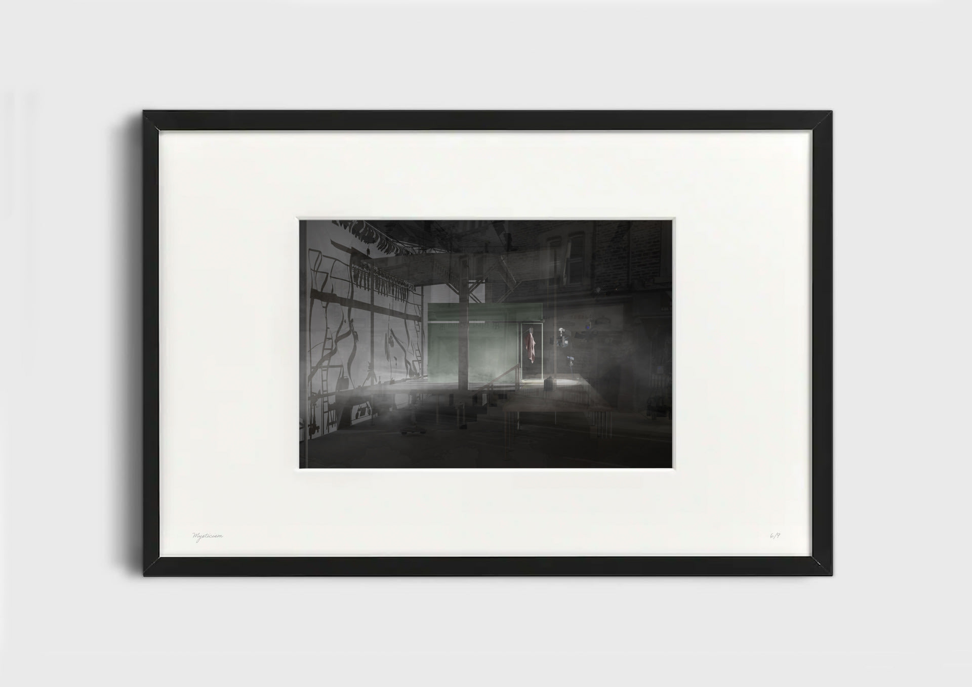
Mysticism
Mysticism — Mysticism uses the display window as a filmset, hinting at how consumers are completely unaware of the calculation, curation and even manipulation that is constructed around them.
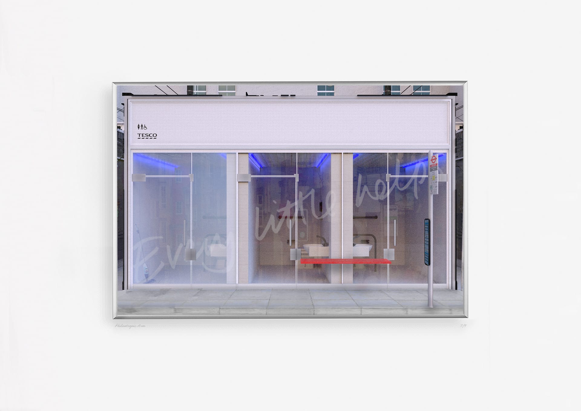
Philanthropic Arm
Philanthropic Arm — And what if we use the shopfront as a device to create extrapolations and fuel fantasies? A place where we showcase estimations by assuming existing trends continue. As the transactional nature of e-commerce strengthens and becomes widely used, does the deployment of empathy become exaggerated and the physical store becomes a place to give instead of take? A place to offer public service and show brand presence?
Statcheck
Statcheck — Or does innovation and regulation allow high streets to become populated with commercial scale factories? Do we begin to understand more about where our clothes come from and who makes them or does the shop window just hide uncomfortable truths?
The Followers
The Followers — The shopfront has the ability to explore the boundaries between fiction and reality. Over time, the shopfront has mediated from the physical to the digital. Our phones acting as an extended reality of the physical shop window open 24 hours a day, 7 days a week. With the rise of social media platforms, the shopfront has evolved to the scale of an instagram tile, the trap has never been such a smooth, filtered experience.

Medium:

Framed Renders

Size:

Varied
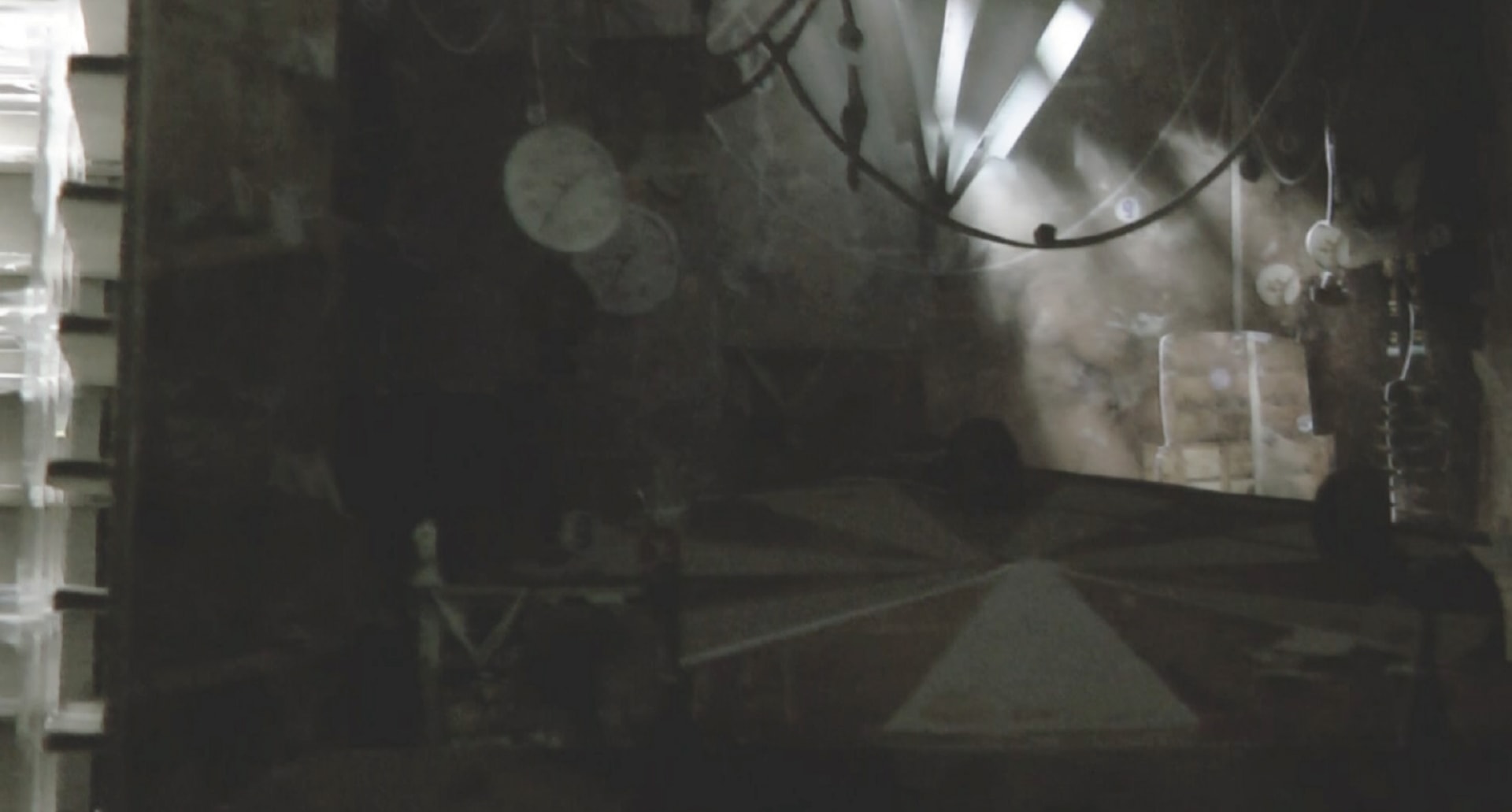
Film Still
Film Still — Through a research model I explored how Apple manages to construct their identity in all encompassing ways, that go beyond the visual realm, utilising the metaphysical nature of architecture. The resulting smoothness is not unlike a dreamscape, seemingly harmless and flooded with light. A lightweight world without obstruction, autonomous to its environment, a hedonistic atmosphere that rejects any trace of sadness and sorrow.
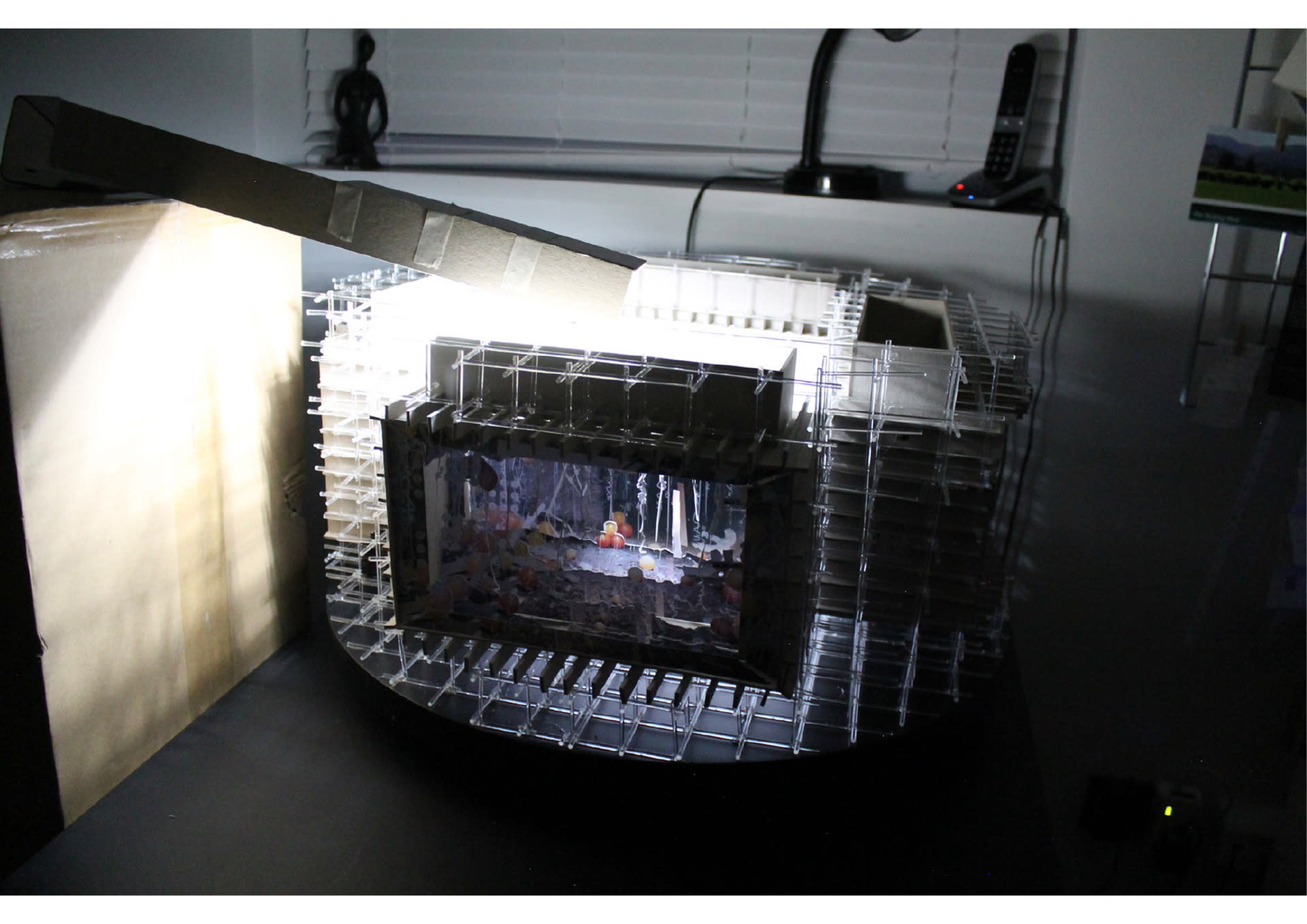
Research Model — "Retail space fosters this phantasmagoria by marshalling all the senses; only sacred space is equally replete with sights, sounds, smells and textures. And the transparent facade - the shop window - is the paradoxically lucid veil for these mysteries" AR Typology Shop Essay
Analysing Smoothness
Analysing Smoothness — Apple so explicitly orchestrates such smoothness and by dissecting the design further through analysing architectural forms, objects and materials..
Analysing Smoothness
Analysing Smoothness — ..what I found was that endless elements of the design triggered associations with feelings of empathy, generosity, trust and community to name just a few. The design manages to use these aspects to seduce passers by, emotionally by triggering entire value systems, but also physically by playing with thresholds and igniting peoples senses.
Analysing Smoothness
Analysing Smoothness — Even when we analyse shopfronts so opposite in aesthetic to Apple, we see endless similarities of these smoothness characteristics being deployed.
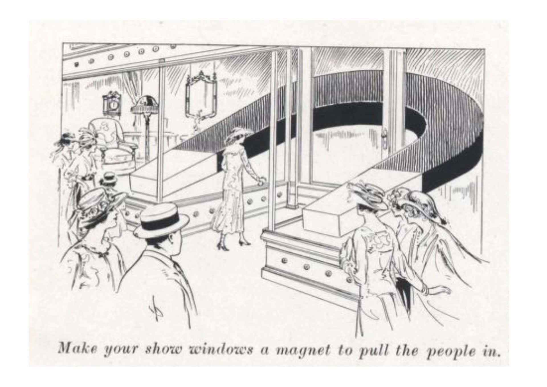
Scan from the book ‘Getting People In’ by Zouri Drawn Metals Co.
Scan from the book ‘Getting People In’ by Zouri Drawn Metals Co. — During the 19th century, endless books were written on how to design shopfronts to lure people in store. From the overall form, with maximising window exposure, and tactics to slow the passer by,
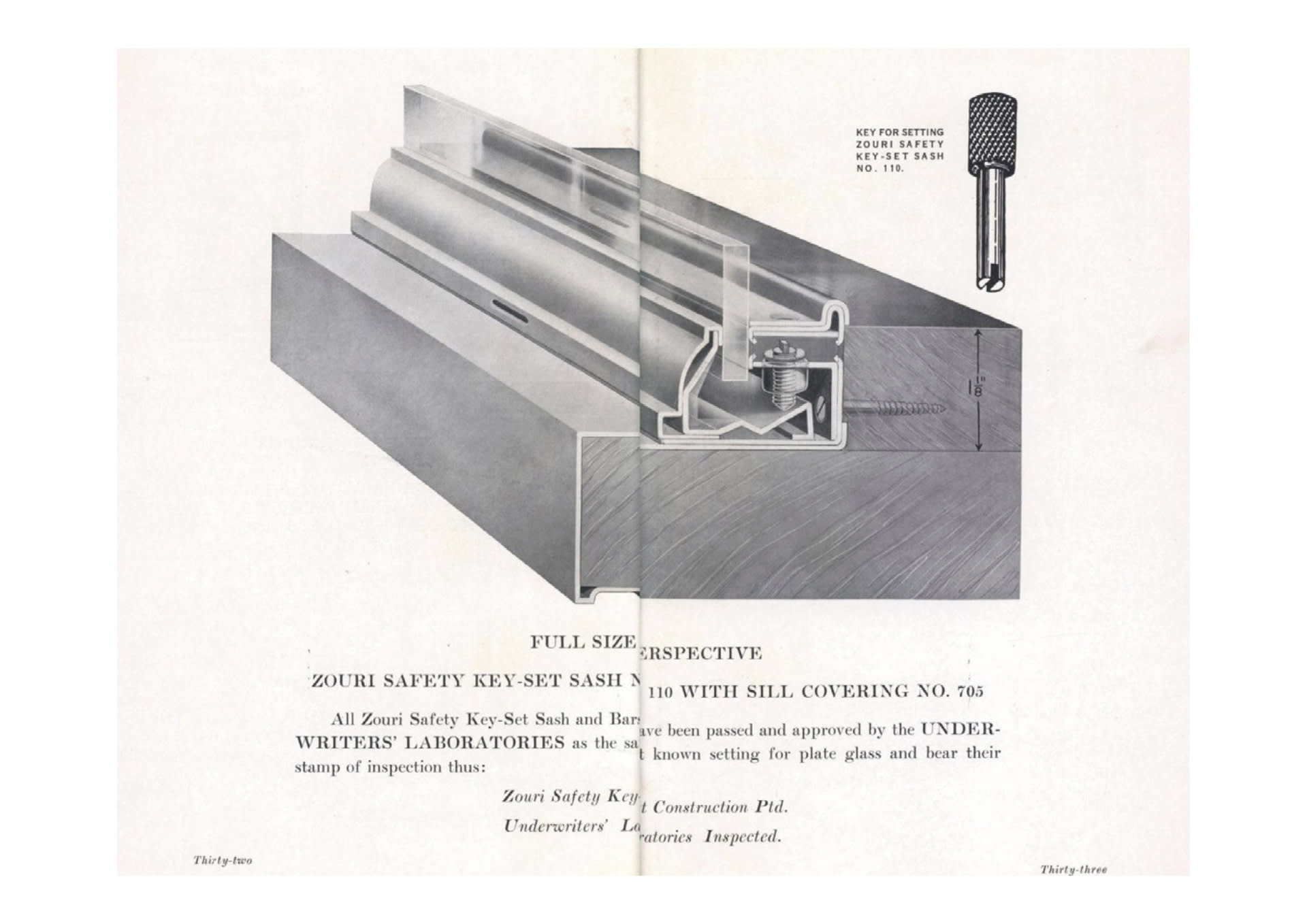
Scan from the book ‘Getting People In’ by Zouri Drawn Metals Co.
Scan from the book ‘Getting People In’ by Zouri Drawn Metals Co. — to the detailing of invisible screw heads, the shopfront became an object of careful scrutiny and calculation designed to lure and crucially evoke the experience of non-conflicting contiguity, of easiness, of smoothness, marshalling technology to create such an uninterrupted experience and aesthetic.
A Rat Trap, “Vogel’s Net: Traps & Artworks, Artworks as Trap” Alfred Gell 1996
A Rat Trap, “Vogel’s Net: Traps & Artworks, Artworks as Trap” Alfred Gell 1996 — The shopfront became a trap, largely unintelligible to its subject.
Anatomy of Trap, Anatomy of Smoothness
Apple Union Square Detail Section
Apple Union Square Detail Section — Often the most calculated of traps, become the most smooth experience of space.
The Shopfronts ability to Narrate
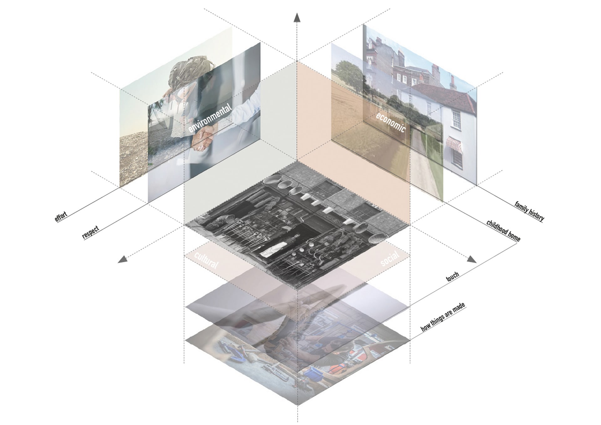
The Shopfronts ability to Narrate — The shopfront as an image also manages to demonstrate an unexpected potential to talk about much larger systems all linked to the current reality of when the photograph was taken. The materiality of a shopfront became a universe in itself, enabling me to understand so much beyond the four corners of the image.
The Shopfronts ability to Reflect
The Shopfronts ability to Reflect — If we study the shopfront as a type of architectural trap, we can train ourselves to extract a portrait of the character looking at the shopfront itself. Not only in general terms where it narrates about society, but the retail expression has the potential to be a reflection of the individual consumer. The trap therefore is a place unique to all of us and the shopfronts that we find the most luring are the ones that can tell us the most about who we are.

Medium:

Varies

Size:

Varies
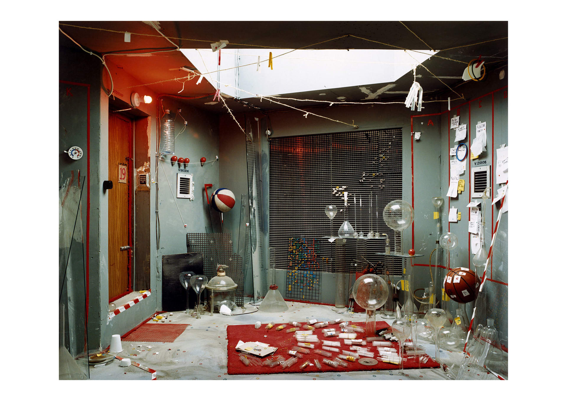
Anne Hardy Untitled
Anne Hardy Untitled
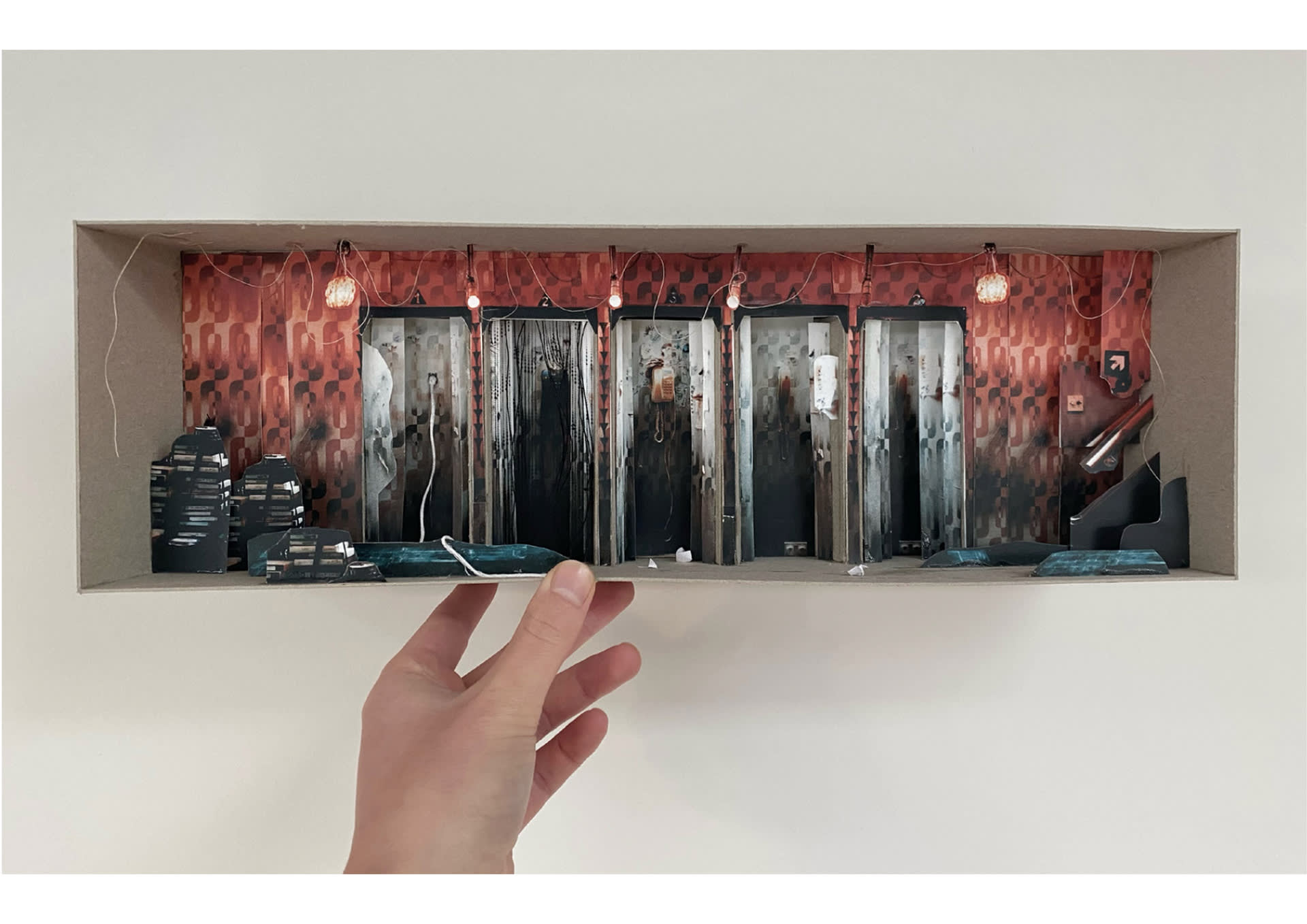
Early test models exploring the layers of Anne Hardy's images, card, paper
Early test models exploring the layers of Anne Hardys Images, card, paper
Film stills
Film stills
Film still
Film still
Anne Hardy Research Model
BTS Shot
BTS Shot
BTS Shot
BTS Shot
Film Still, Research Model on Apple Shopfront, 60x60cm paper, cotton & acetate
Construction behind the image
Collage
Collage
Collage
Collage
Collage
Collage
Collage
Collage