Interior Futures

Kate Esslemont

Living in a remote part of the North Norfolk coast has brought out a sensitivity to my surroundings and natural environment, it’s changing forms, patterns and processes.

With a background in Illustration, graduating from Norwich University of the Arts with a first class honours BA degree '17, conceptual thinking and storying telling have translated fluidly into the process of designing for the built environment.

A collaboration with the Creative Writing course at the University of East Anglia project marked the beginning of my journey from illustration into spatial design. The project created a dialogue between students; in response to the poetry received, I created immersive installations, using sculpture, film and projection to explore the senses, and to create a visual language in response to the emotional narrative extracted from the poetry. 

As this love for visual communication developed into spatial explorations communicating narrative, I joined the curation team as a furniture designer. I worked on external exhibitions - ‘We are Here’, business centre Islington and ‘Ampersand', Dove Street Studio - and exhibitions within the university - NUA degree show. With a desire to learn more about design and architecture, I interned at Sheridan & Co, a global retail design specialists, and did a further internship at The World of Interiors.

My thesis 'Healing Spaces', analysed existing spaces of healthcare with the theories of Environmental Psychology and Psychoevolutionary research, to decipher whether their design hindered or aided the healing process. Specialising in the Futures Platform, our focus lies within human-centric and science informed design to create environments which implement the principles of wellbeing, which has led to this body of work which looks at creating performative spaces to aid the healing process, mentally and physically.

Kate Esslemont

How can we as designers positively influence the process of healing? 

I have developed an infatuation with the process of healing in relation to our surroundings. As a designer, I am concerned with the spaces we occupy, built functionally to be restorative, meaning to positively influence the process of healing. There is an emerging emphasis on the word “wellbeing” among modern people, as the effects stress can have on our holistic health are evidenced. Holistic health considers the health of the entirety of the individual, equalling psychological and physical states.

If we can universally understand that stress causes illness, and we can universally understand that the spaces we occupy impact our behaviour and mood, then we can accept that as designers, we have the power to improve or damage the health of humanity through the spaces we create. This ability and responsibility needs to be utilised in a positive way. Research into psychoevolutionary theories shows us there are universal human preferences over spatial configurations, evolving from the pleasures and fears of our ancestors. Scientific research such as this enables us to create informed design decisions, forming spaces which engage humans in a positive, and therefore, healing dialogue. The point where this research meets functionality is where I seek to design. 

Continuing the observations from my thesis “The Healing Space”, I propose to design a hybrid space for healing. Inspired by the success of Maggie’s Centres for those suffering with cancer and their family members, I found a lack of physical support for all those suffering from chronic illness. Alongside this finding and analysing our current healthcare system in the UK, I feel there is a void in preventative healthcare. For the individual to ask how they can become healthier, addressing any stress or trauma which could manifest as illness if left untreated. This space becomes a sanctuary within the city for those suffering with chronic illness, providing management of symptoms, treatment and therapies, and a space to connect with others, together with a preventative element to the space, welcoming all for medical check ups, lifestyle advice, and education on how to minimise the impact stress can have on our health.

The Story of the Design

With the inspiring creation of Maggie’s Centres as a physical and non-clinical place of support for those suffering with cancer, alongside the growing awareness of the Wellbeing movement valuing the importance of mental health, there is vast space for progression in the way we approach the system of healthcare and the spaces which represent healing. 

PURPOSE Urban Sanctuary is a medical neighbourhood which activates prevention rather than cure, as well as providing a physical place of support for all those suffering with chronic illness. Welcoming all for medical check-ups, lifestyle advice and education on how to minimise the impact stress can have on our health. A place where medical records, diagnosis and treatment are accessible, organised and collaborative, looking at the entirety of the body. A space and program to support you medically, mindfully and socially. 

A place that remains, that is a constant. A place of restoration.

DESIGN The design will challenge the linearity and uniformity of healthcare design. Looking to environmental psychology to inform the design decisions, such as using curves and flowing forms instead of sharp edges and lines. It has been evidenced that curves are more harmonious to people, and can actually influence a sense of calm. Research into psychoevolutionary theories shows us there are universal human preferences over spatial configurations, evolving from the pleasures and fears of our ancestors. Scientific research such as this enables us to create informed design decisions, forming spaces which engage humans in a positive, and therefore, healing dialogue. With this in mind, Urban Sanctuary will be formed by a series of healing landscapes to reduce stress and encourage a sense of space which can be freely interpreted by its inhabitants - like being in a natural environment.


Interestingly it has been discovered that our ancestors preferred to settle in locations on active tectonic faults, in areas that have an earthquake risk or volcanoes, or both. The reason for this was that regions vulnerable to earthquakes and volcanic activity often create landscapes with long-term benefits for human settlement. The combination of drinking water, steep cliffs that provided shelter from predators, together with a range of feeding sources constitute the key ingredients for an ideal habitat for our ancestors. (University of York. “Human ancestors lived on shaky ground.” ScienceDaily. ScienceDaily, 3 March 2011. ) 

It is evidenced that these preferences over our landscape contribute to our psychological response to the spaces humans experience today. How can we use these preferences to design spaces which improve the wellbeing of modern people?

This film exposes the areas of research which informed the design of Urban Sanctuary.

5 St Pancras Square
5 St Pancras Square — Creating a place for Wellbeing and Preventative healthcare within the high rise, to provide a forward-thinking outlook on health for the borough of Camden and beyond.
Utilising height to provide a sense of safety from the Urban Landscape below
Utilising height to provide a sense of safety from the Urban Landscape below — Urban Sanctuary is housed in the highest three floors of the building, the entrance lies on the Upper ground floor, and a Pause space integrated into the office space on Level 5 breaks the vertical journey. Utilising the highest floors of 5 St Pancras Square to provide a sense of safety, distance from the ground, just like our ancestors utilised the trees for protection from predators on the ground. A place for sanctuary, refuge.
 A series of insertions within the building to house Urban Sanctuary
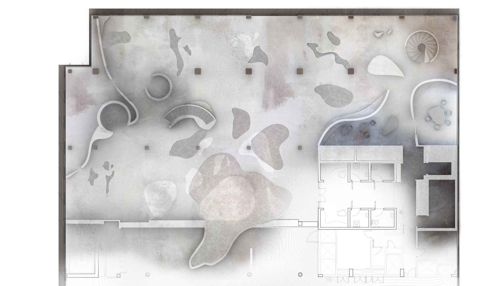
A series of insertions within the building to house Urban Sanctuary — A series of therapeutic landscapes will be inserted into the linear boundaries of the high-rise. The floor and ceiling undulate to encourage the user to be mindful of where they are walking, similar to walking through a natural environment. The floors undulation will be at a 1:60 gradient, this gentle gradient means it's accessible for wheelchairs without a ramp. The journey's within these spaces become a meditative exercise.
What forms the landscape of the interior?
What forms the landscape of the interior? — New openings in the floor, their shape extracted from tidal pools in the marsh, will be formed, and covered with shallow water to improve privacy. Orientated with reference to the existing atrium, these new openings allow for improved horizontal circulation, with routes through the centre of the space rather than void. Curved walls forming dense and then more open spaces create places for refuge and restoration. The curve also curates the users views to inside, outside and in-between (up through atrium).

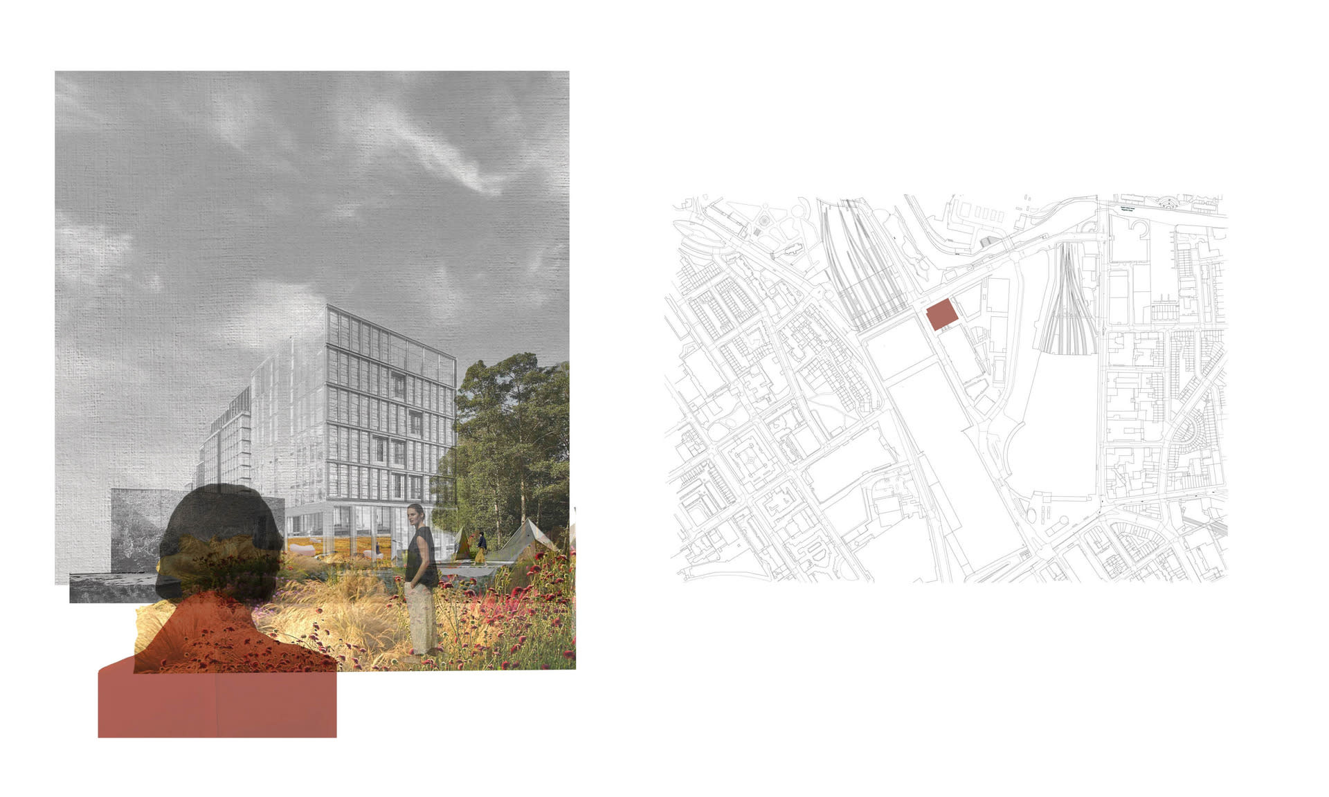
LOCATION 5 St Pancras Square, London.

Currently occupied by Camden Council, whilst also providing services for the public such as a Library, Cafe, Gym and Pool.

Unraveling the design of Urban Sanctuary (US), a hybrid space for healing within boundaries of the high-rise 5 St Pancras Square, London. In our post-Covid world, many office spaces will need a new purpose, this project creates a series of insertions within the building to house US whilst keeping the current spaces for the public and a reduced portion of office floors for Camden Council to operate. 


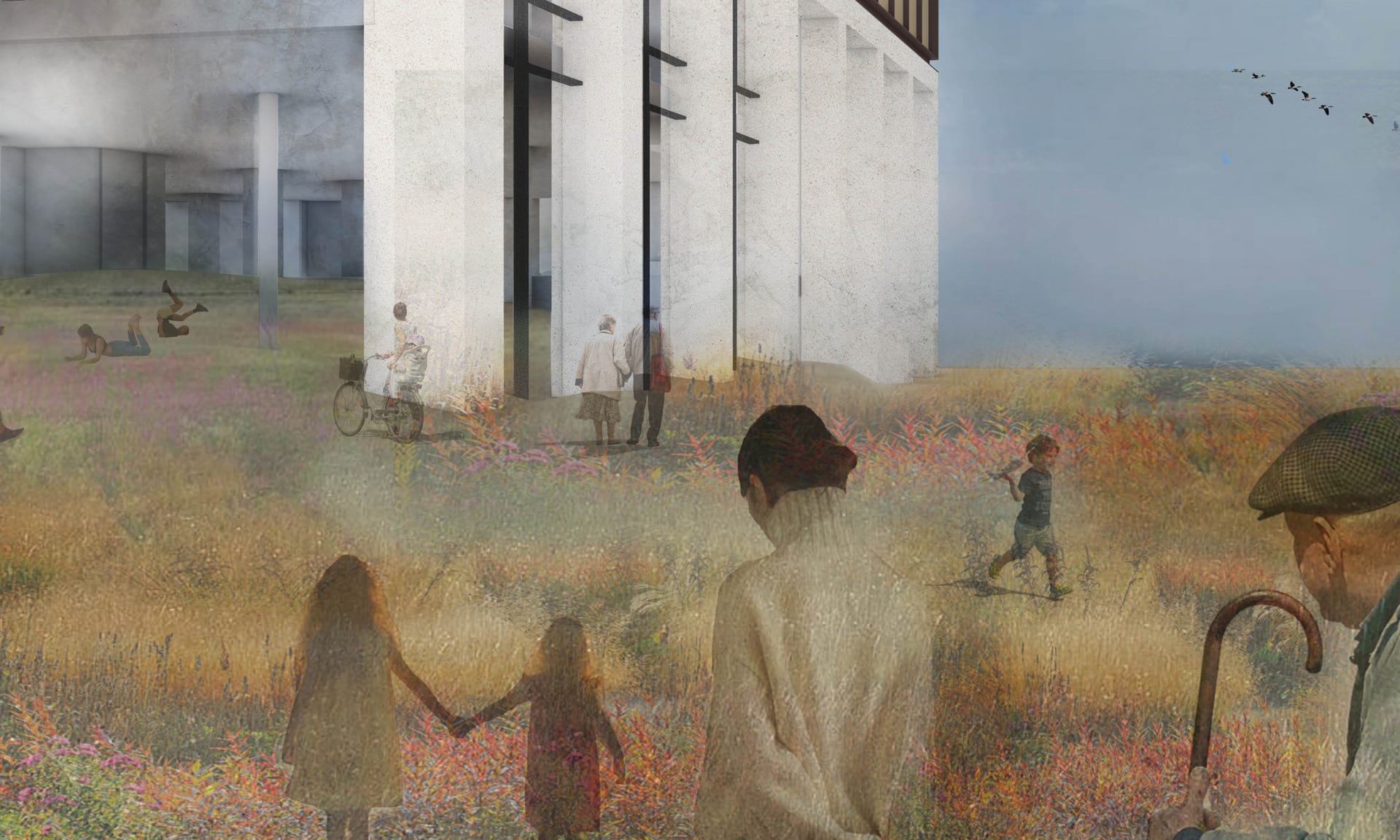
An extension of Camley Street Natural park, a space to reach wider, a space of activism in preventative healthcare
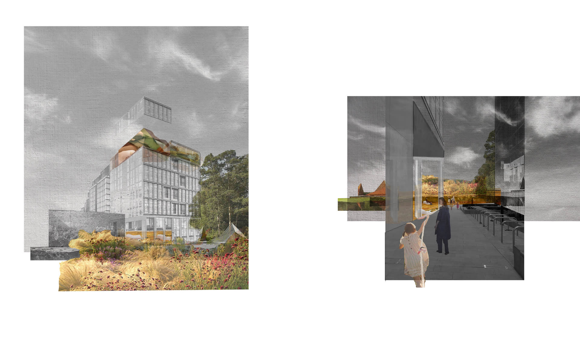
An extension of Camley Street Natural park, a space to reach wider, a space of activism in preventative healthcare — This entrance encourages contact with nature, starting the healing process with the first steps into the building - nature as the prescription for health. ‘“What we desperately need is connection with our blood and soil," says Juhasz, a professor of architecture and environmental design at the University of Colorado in Boulder. "We're estranged from our blood--ourselves as human beings, and our soil, our natural environment--at this moment in our culture" (Juhasz, J.B. n.d).
Entering the high rise
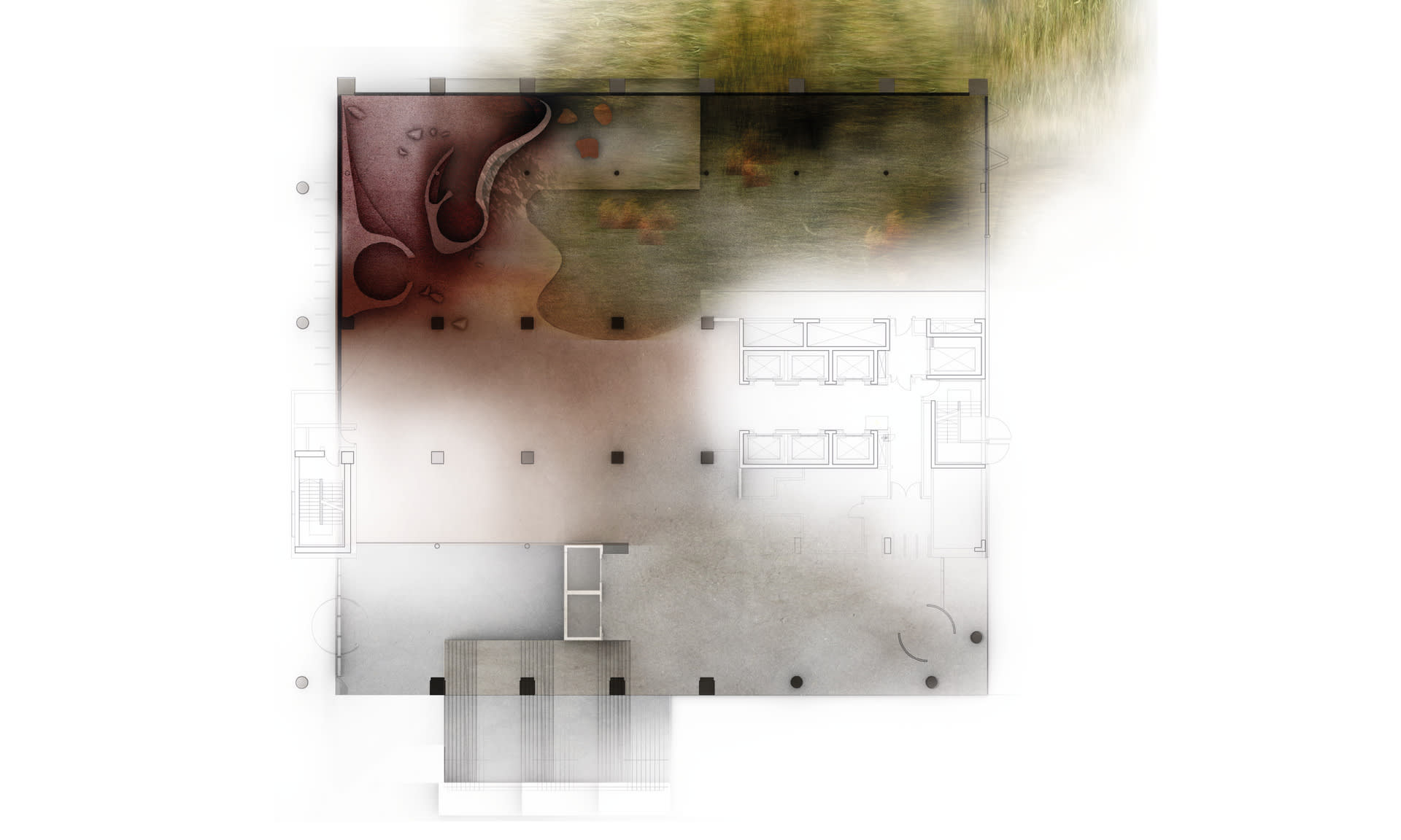
Entering the high rise — There are three ways to enter the building, on the LG there are lifts and stairs up to the UG floor which is where the lifts for Camden Council are located, as well as the lifts to Urban Sanctuary. The second entrance is on the UG floor coming from Pancras Square. The new entrance sits on the North side of the building, walking in from Goods Way, an inserted landscape bridges the gap between the street and the UG floor, becoming an extension of Camley Street Natural Park.
The Entrance, Street Level to Upper Ground Level
The Entrance, Street Level to Upper Ground Level — This inserted landscape bridges a gap between the pavement and the UG Level through varying gradients, whilst also providing an extension of the park for recreational use. The gradient is more varied here, forming a more extreme landscape.
The Entrance, Upper Ground Level
The Entrance, Upper Ground Level — Once the UG level is reached, the floor gradient returns to a 1:60 gradient, making it accessible for wheelchair access, and more gentle for those who are not feeling well.
Beginning the healing journey with the first step into the building
Beginning the healing journey with the first step into the building — Urban Sanctuary has separate lifts from the rest of the building. There are two lifts, the larger lift facing into the space, and a smaller lift tucked around the corner looking out to the park, sheltered from the rest of the space. This is for those who are not feeling well and/or need a quiet route up to the space.

A new opening to the UG Level will be created for the users of Urban Sanctuary, becoming an extension of the Camley Street Natural Park which lies opposite. This encourages visitors to walk through nature before entering the space. It also becomes a space of activism in preventative healthcare, encouraging the wider population of Camden Borough and its visitors to see the value of nature to our health.

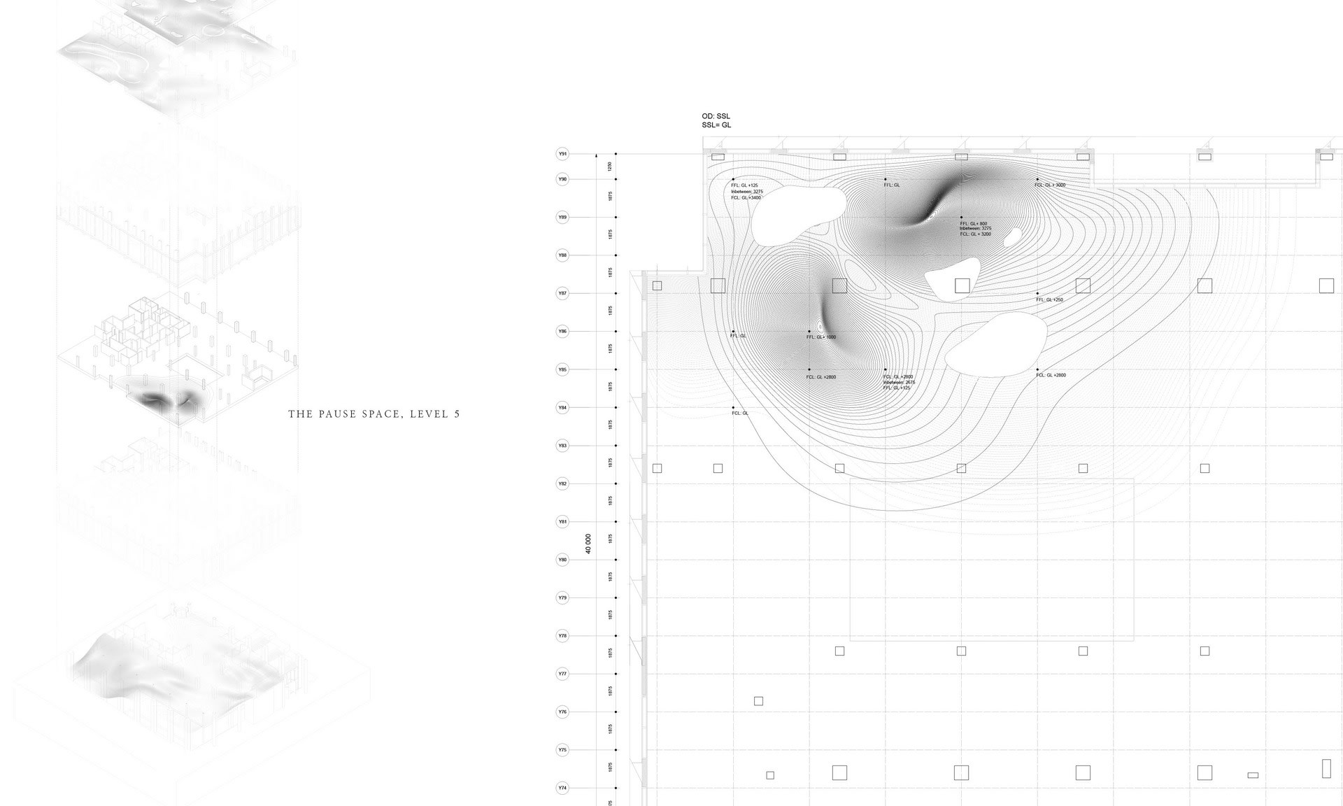
The Pause Space, Level 5
The Pause Space, Level 5 — A blended place of restoration, for the employees of Camden Council as well as those visiting Urban Sanctuary.
The Pause Space, Level 5
The Pause Space, Level 5 — Undulation, a landscape is formed. This floor undulated at a 1:60 gradient, as well as forming two more extreme inclines meant for providing a space to lean, to lie down, or to rest against. The floor becomes the 'furniture', and can be freely interpreted in its use.
The Pause Space, Level 5
The Pause Space, Level 5 — Each floor plays with levels of density to successfully inhabit all patients with varying needs. Dense, cave-like spaces provide a place where one can withdraw, take refuge, or hide. Then, transitioning to more open, light spaces where one can find sources for restoration, nourishing the mind socially and body through movement and interaction.

A pause space is situated on Level 5 to break the vertical journey up to Urban Sanctuary. It provides a space to stop or to turn around if the visitor is not feeling emotionally or physically ready to continue the journey. This area also provides a place of restoration for the Camden Council office workers.

The Consultation Room, Level 9
Mindful walking, The Preventative, Level 9
Mindful walking, The Preventative, Level 9 — Undulation, the interior is formed of a Landscape. The floor undulates at a gradient of 1:60, making it accessible for wheelchair access without a ramp, as well as providing a meditative journey as one walks through the space. Accessibility is prioritised throughout this design, ramps are subtly integrated into the undulating floor, providing access to spaces where the decline is greater. Ramps are also used to define boundaries between individual spaces.
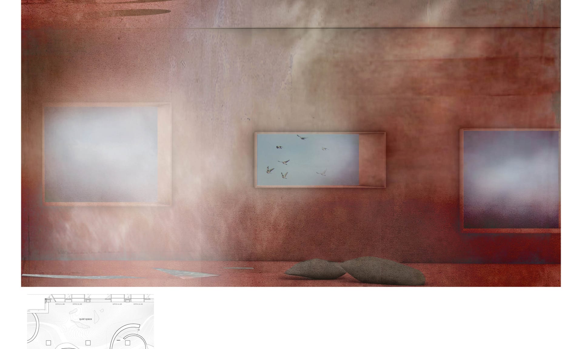
The Quiet Space, Level 9
The Quiet Space, Level 9 — The more open spaces are located on the North face of the building, prioritising the views to the Natural Park. The curve works with the views inwards, outwards and up, guiding the occupier to curated views as they experience the space. Cuts into the existing curtain wall frame the view of the park. These new openings are positioned at various heights to maximise visibility.
The Living Space, Level 9
The Living Space, Level 9 — The living spaces are positioned in and around the central open area, providing a place for restoration with good visual surveillance over the rest of the space. With reference to Psychoevolutionary research into human preference over spatial configurations, the design language holds characteristics which relate back to our ancestors use of savannas as a place for restoration and nourishment. Supplying rich food and water sources, and with good visual surveillance to watch over predators far into distance.
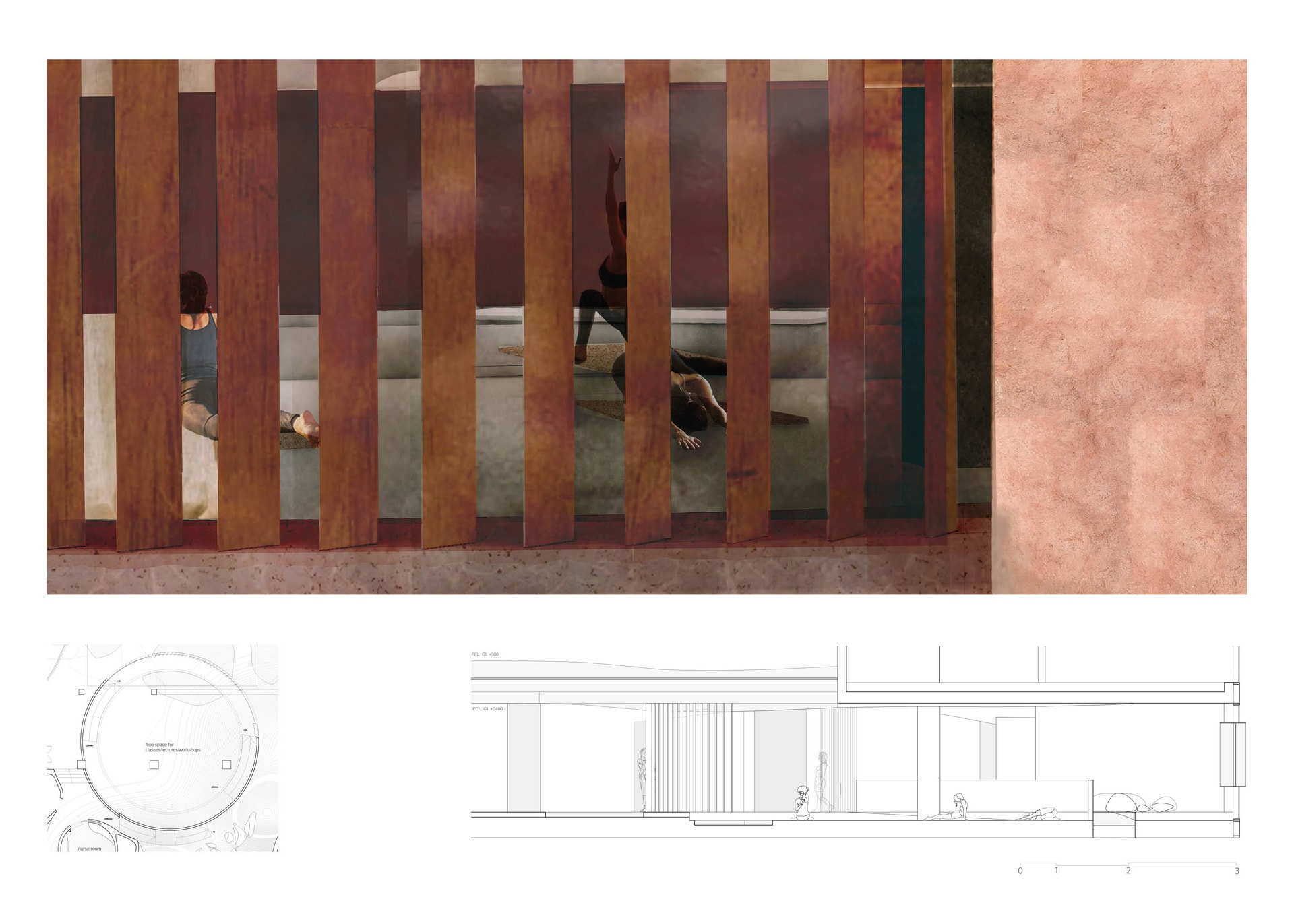
The Large Flexible Space, Level 9
The Large Flexible Space, Level 9 — The large flexible space is integrated into the central area of nourishment. All the central spaces have flexible partitions for open or semi-private functions. When walking to an appointment, visitors would walk past classes and workshops taking place in the central spaces, introducing them to preventative healthcare through experience. The versatile space allows for classes, workshops and conferences to take place, with storage spaces integrated throughout the floors to accommodate for multiple functions.
The Waiting Room, Level 9
The Waiting Room, Level 9 — Denser spaces are positioned near the West and South faces of the building, where views outside to the road or urban environment are not prioritised. Cuts into the curtain wall in these areas are covered with a translucent material, to let light through whilst maintaining a sense of withdrawing in the dense, cave-like walls.
The Preventative, Level 9
The Preventative, Level 9 — Treatment and living spaces utilise a centralised spatial strategy, allowing for good visual surveillance when walking through the space, contrasting to the long corridors we usually experience in clinical environments. Treatment, nurse, and medical secretary rooms are grouped so the practitioners within these spaces can easily converse and collaborate. Spaces become denser towards the South face of the building. Patients can choose between open or dense spaces for their treatment depending on symptoms.
The Preventative, Level 9
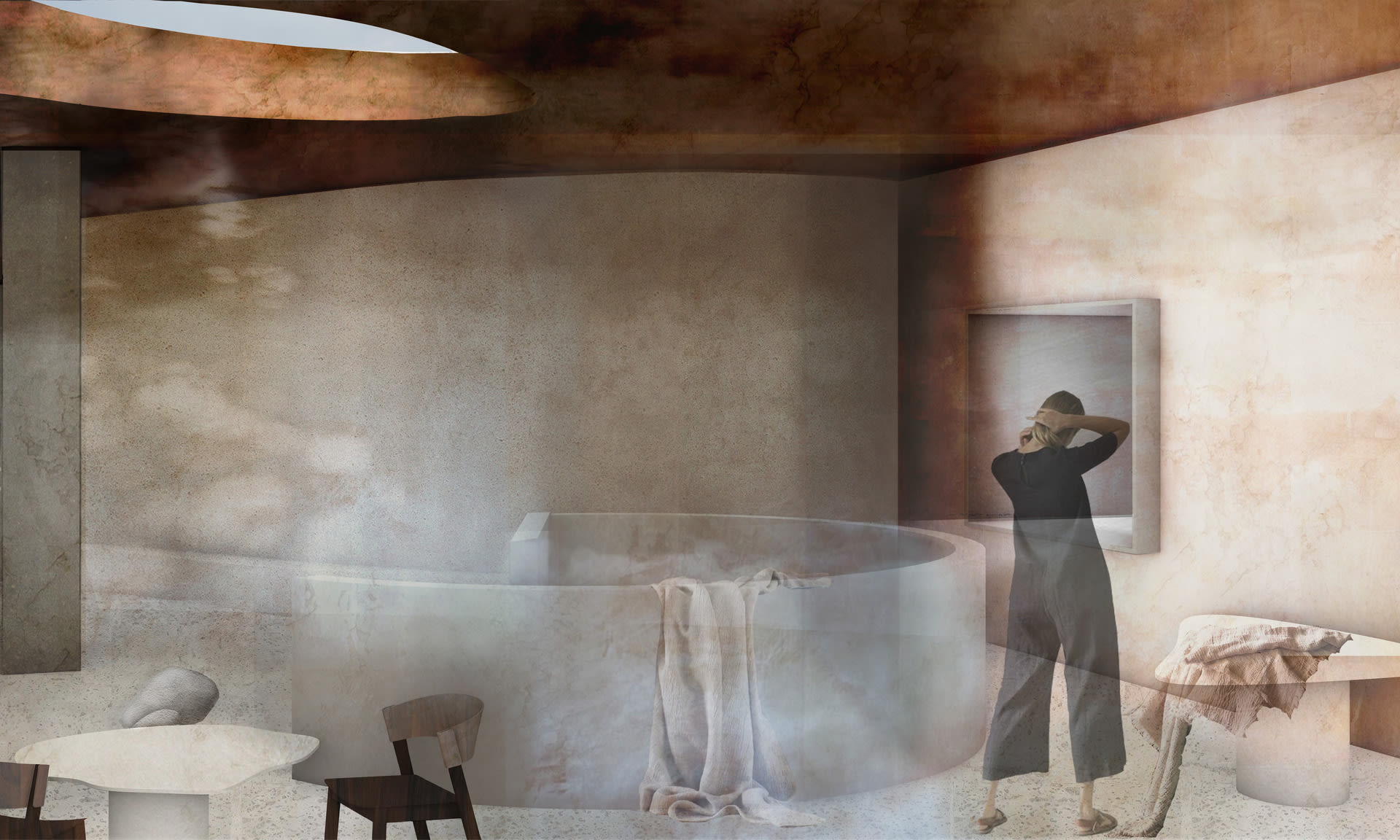
The Preventative, Level 9 — This design values curves over linearity as a form of creating a stress-reducing environment to aid the healing process. Some furniture is part of the walls or the floor to create an environment that can be freely interpreted in its use. The living area holds soft sculptures for comfortable seating, inspired by forms of the landscape such as the uneven form of a pebble. The visual language uses rocks and water to encourage uses to walk through the space in a specific way, defining areas and clearing views.

The Preventative floor provides spaces for doctors’ offices, nurses’ stations, medical secretaries, medical archives, therapy and treatment rooms, alongside practices such as meditation and yoga. The spaces are all designed to be multi-functional and adaptable, to be able to house various therapies and treatments and also provide space for lectures, conferences, and classes.

A Freely Interpreted Landscape, Level 10
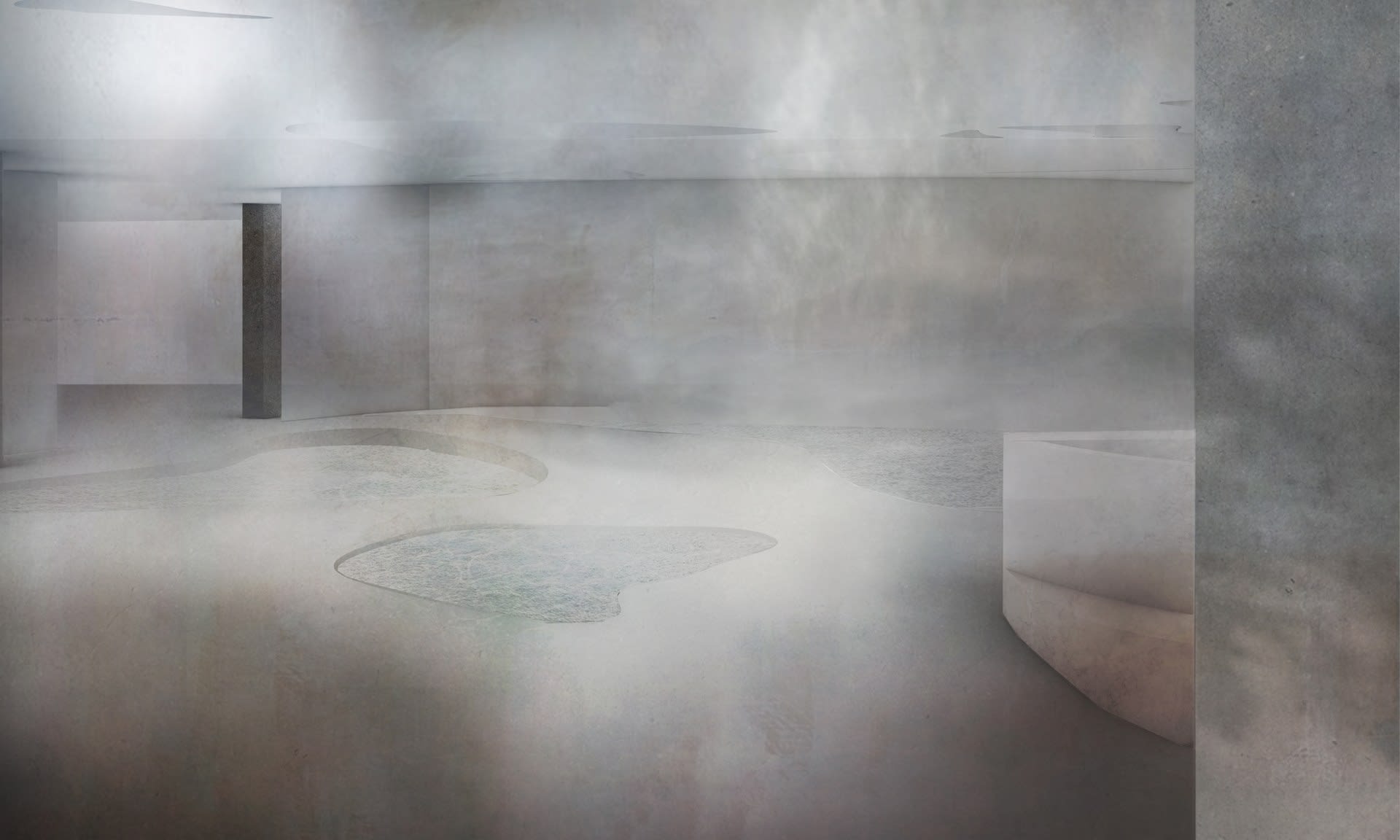
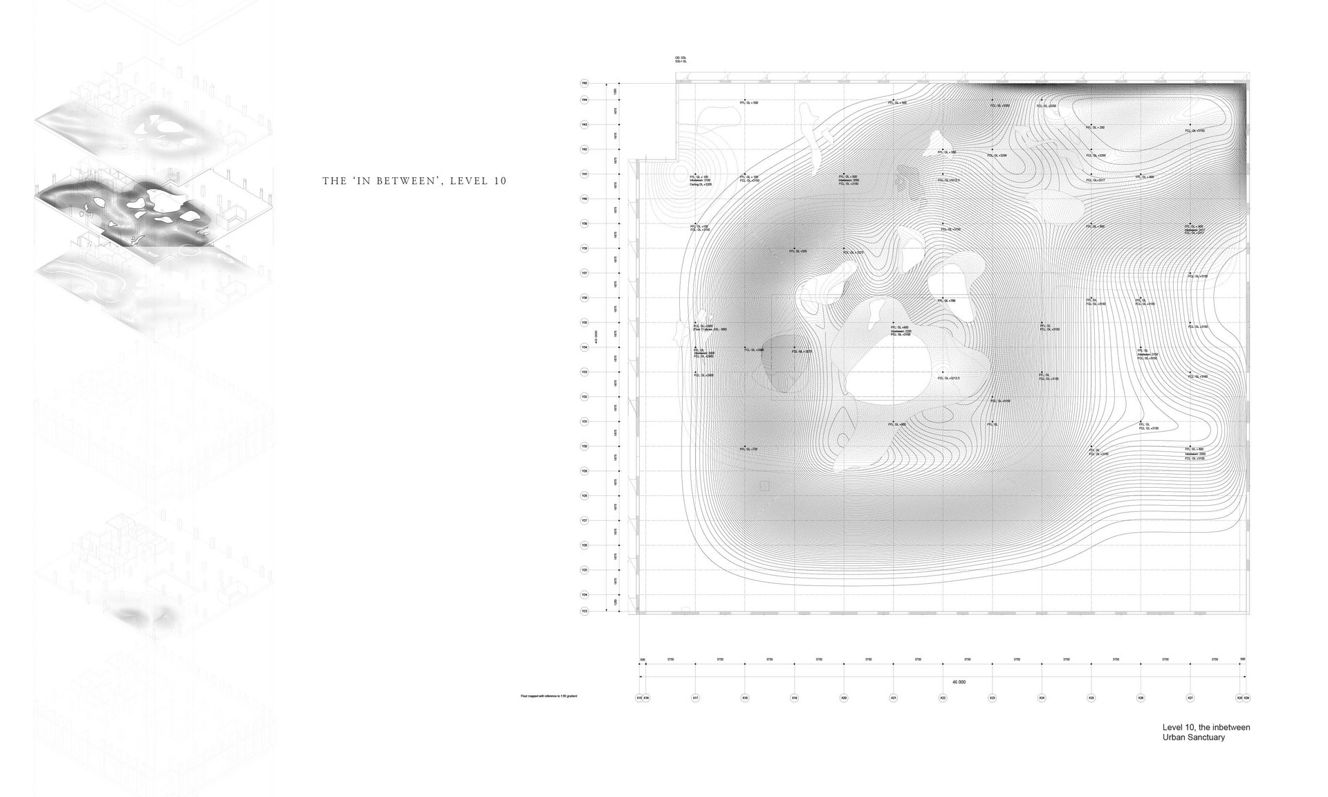
The In-Between, Level 10
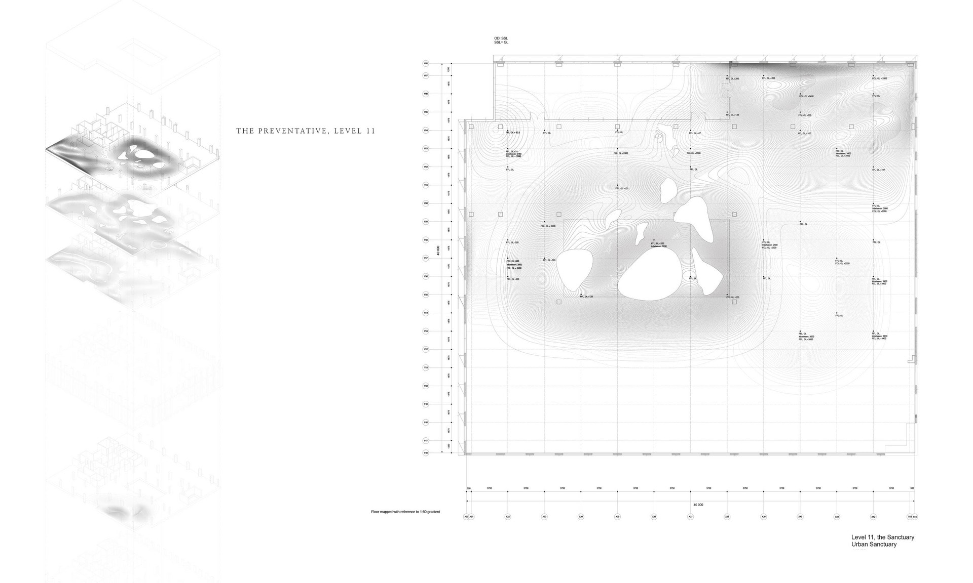
The In-Between, Level 10 — Undulation, the interior is formed of a Landscape. This environment functions as a breakout space for both floors, the landscape is more extreme here and it’s use is freely interpreted freely, there is no furniture. The steeper gradient supports the users body for resting and leaning against. Moving through this landscape also becomes an exercise. The pools of water which are the atrium, add to the meditative landscape, the surface of water interacting with the natural light it brings into the interior.
The In-Between is shaped by the Landscapes above and below
The In-Between is shaped by the Landscapes above and below — The 'In-Between' level is shaped by the ceiling of the preventative and the floor of the sanctuary, mirroring the incline and decline of the landscape above and below. This creates a connection between the levels, a gives a sense of pace on the vertical.
 A place of contemplation, Level 10
A place of contemplation, Level 10 — The way this Landscape has been formed, mirroring the movement of the floors above and floor feeds into the intended function of the space. A break-out space providing a place for contemplation, to reflect, to gather your thoughts and emotions. A pause in the rhythm of daily life.
The In-Between, Level 10
The In-Between, Level 10 — Urban Sanctuary is for the wellbeing of all. Practitioners are not segregated in the same way they are in clinical environments, but rather part of those experiencing the space whilst sharing their expertise. Collaboration between practitioners is what Urban Sanctuary strives for, part of this level provides a dedicated place and kitchen for practitioners to meet and collaborate, when they seek privacy. They can also utilise many of the flexible spaces.

The space ‘In between’ the preventative floor and the sanctuary provides a break-out space for patients to have access to rest, to meet with others, to meditate. This floor also houses a private space for doctors and practitioners from different specialities to collaborate. A freely interpreted landscape.


The Terrace, Level 11
The Sanctuary, Level 11
The Sanctuary, Level 11 — Undulation, the interior is formed of a Landscape. The floor undulates at a gradient of 1:60, making it accessible for wheelchair access without a ramp, as well as providing a meditative journey as one walks through the space. There are no stairs in this space, ramps take the user to spaces which sit at a deeper level.
The Kitchen, Level 11
The Kitchen, Level 11 — The Kitchen within the Sanctuary provides a more domestic-like space. With a large surface for cooking demonstrations and nutritional workshops, as well as smaller tables for more intimate conversations. The large Pantry allows for those coming to the space with dietary restrictions to store their food.
The Kitchen, Level 11
The Kitchen, Level 11 — The stairs leading to the space 'In-Between' are situated in the Kitchen, allowing for those entering the space from level 10 to arrive in the Kitchen, feeling as sense of being at home. A Kitchen environment also encourages interaction between users in a relaxed atmosphere. Sharing appliances or food is a good way to start conversation, and encourage connection.
The Atrium and Therapy Room, Level 11
The Atrium and Therapy Room, Level 11 — The Sanctuary also utilises a centralised spatial strategy. With the Quiet Space in the centre, where the pools of water which are the atrium dispersed lie, encourages an even slower pace from the rest of the building. View upwards are prioritised here, as it's the highest floor views of the sky are exposed. Some of the curved walls surrounding the Quiet Space are built at an angle, to encourage users to look up when leaning against the wall.
The Atrium, a walk through the central Quiet Space, Level 11
The Atrium, a walk through the central Quiet Space, Level 11 — When walking through the central Quiet Space, gaps between the curved walls reveal the trees on the terrace outside. A space where views to outside are prioritised.
The Medium Therapy Room, Level 11
The Medium Therapy Room, Level 11 — This Therapy room is designed for group therapy. The curved shape of the room is to encourage inclusivity and interaction. The only view being up is intended to limit distraction, and to put the users focus inwards towards themselves, whilst revealing a small opening up to the sky to give a sense of openness, light and positivity.
The Sanctuary, Level 11
The Sanctuary, Level 11 — On arrival the curved wall allow for visitors to stop rest, and provides a place for them to turn around if they aren’t ready to go into the space. There are different routes from the lifts to take depending on how you are feeling, for example you can walk through the terrace garden to get to the kitchen or living room. The central space is a quiet space connecting the surrounding rooms. The sanctuary provides an even slower pace, with seats and ridges integrated into the curved walls throughout the design.
The Sanctuary, Level 11
The Sanctuary, Level 11 — Colours for different stages of healing are considered. The Sanctuary is for those who are lacking in wellness, purples and blues are used to signify healing. The pink more orange tones are to improve circulation and energy, the earthy lighter colours provide space in between.
Urban Sanctuary, a hybrid space for healing
A Patient's Journey, Urban Sanctuary

The Sanctuary is a domestic-like environment exclusively for those with a chronic illness providing a space to work and socialise, a home away from home, enabling those to flourish and connect with others. As well as symptom management, therapy, group workshops and classes, life advice and a benefits advisory. This space provides an even slower pace, with cave-like naps rooms for those that require rest during the day. Seats and ridges are integrated into the curved wall to provide places to rest on the horizontal journey through the space.

Mapping the Undulating Floor and Ceiling Levels
Mapping the Undulating Floor and Ceiling Levels — Collected observations of the geomorphology of natural Landscapes from Norfolk provided a taxonomy of natural spaces to refer to during the design process. Extracting the curves and changing forms to influence the shape the interior landscape takes. These images show the process of mapping out the changing levels of the floor and ceiling.
 The Atrium, Process
The Atrium, Process — The existing rectangular atrium penetrates Levels 2 - 11, bringing light into the office spaces. This design proposes to create new openings in floors 9-11, sealed with glass to stop the sound travelling between floors and filled with a shallow amount of water, these pools become a part of the therapeutic landscape, their forms inspired by tidal pools which form in marshland and fill with the incoming tide. These new pool openings are dispersed to allow the light to appear dappled and improve circulation.
How can the wall support the body?
How can the wall support the body? — A series of photographic explorations to find 'the gaps' between the body and the linear, rigid wall. The purpose of the curved walls in this design is to support the body and support the user mentally, providing spaces to retreat, to lean, to socialise etc. How can the form of the wall encourage these emotions and accommodate these behaviours?