ADS5: The Universal Campus

Jonathan Lau

Currently based in London, Jonathan had his bachelor BA(AS) at the University of Hong Kong, where he was graduated with Dean’s Honours List (2017 – 2018) and David Wong Memorial prize (2017 – 2018). To widen his experience and thirst for knowledge, he has joined multiple volunteers, internships, and competition over the past few summers, ranging from on-site constructions, concept designs, interior planning, façade designs, top-down planning, and many others. On top of that, these experiences also enlighten him on the importance of collective intelligence and user-centre designs. This belief is further enhanced as he worked for a year in Aedas before joining RCA, during which he cooperated with various teams and consultants over four commercial complex projects.

In previous academic years, he always works on projects that are radical and imaginative, like artificial ecosystems, horizontal skyscrapers, prototyping cave designs etc. Yet this year in ADS5 he investigates something more grounded and humble, he challenges the use of fundamental architectural element - corridor. Studied its effects on user experience, and explore and developed the found relationships.

Jonathan Lau

The project starts off with a thorough study of corridors. How does its existence change our design? When does it appear? And why does it become so common nowadays? Surprisingly its ubiquity happens recently around the 1900s, driven by problems of the industrial revolution (i.e. urban centralization), and contributes to today's social isolation, as segregation and solitude are praise as solutions by planners of the time. On the other hand, during the 1600s when planning with corridor-less thoroughfare rooms remained to be the norm, people are valued as a source of entertainment, everyone lives with the public with no desire for privacy, as it is merely a term for undignified affairs than the definition we know today. With these backgrounds in mind, my project aims to revisit corridor-less designs and explore new typology in reengaging the lost social connection.

The exploration comes in 3 steps. Starting with the removal of corridors, the driving element that pushes domestic segregation. Then designs of characteristically diverse space in tailoring the promenade experience of the newfound thoroughfare rooms. And finally going beyond spatial designs to inhabitation by introducing hospice as the program to invigorate the space. This ultimately results in a healing architecture. One that helps to maintain mental and social wellbeing through the encouraged interaction and liveliness promoted by "compressed" thoroughfare experience. While the activities and treatments introduced helped to aid more on the physical wellbeing of the patients.


01 | Cause of the exploration
02 | Exploration in spatial identities
03 | Moments of the curated space
Main spatial identity explored
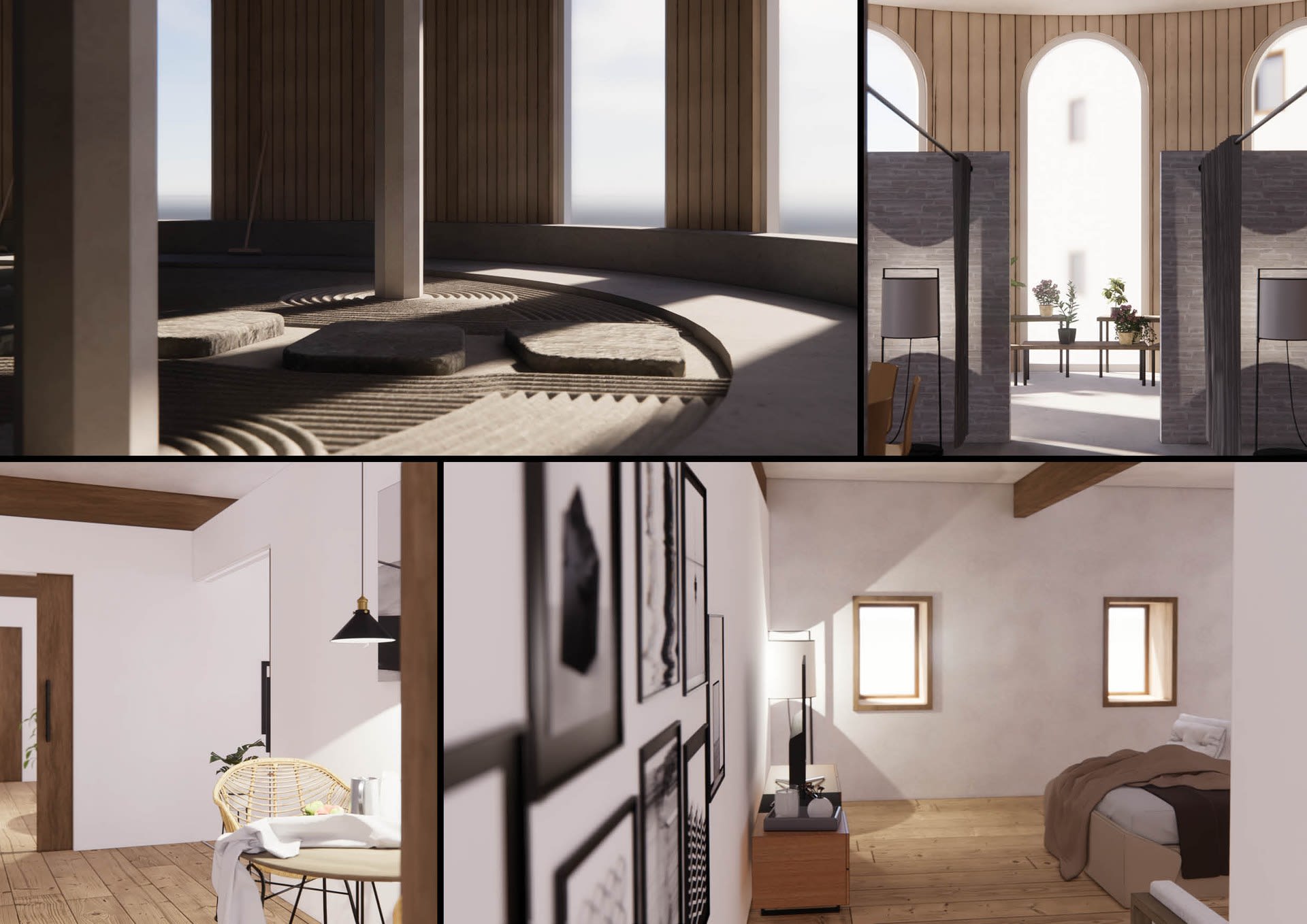
Main spatial identity explored — Loner (left), extrovert (top right), introvert (bottom right)

Today, despite living in the most connected digital age, most people still deal with loneliness. The project recognized this phenomenon as a result caused by planners in the 1800s, solutions made to solve the city problems caused by the industrial revolution, creating an urban environment of segregation and solitude. And domestically, we made corridors ubiquitous, closeting rooms, grounding visits with purpose and justifications, and treating people as mere sources of irritations. In reversing the effect, plans without corridors are made. The plannings of John Soane are studied, and the concept of twin phenomena is referenced in developing a strategy to sequence the result thoroughfare rooms, and hence curate the promenade experience. In which the strategy applied is the adaption of generic identities, defining characters and aims of the space to help locate their positions and developed their architectural attributes. 

04 | Integration and design of the hospice
05 | Daniel and Elena's day in the hospice
Floor Plans
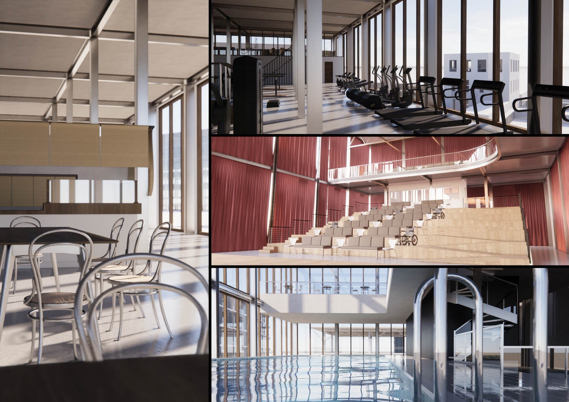
Floor Plans — All layouts are designed concerning the given architectural elements and installed with minimal disturbance to the original character. Extrovert always enjoys a continuous open-air despite large units are occasionally installed. The chapel-like tranquillity always remains in introvert despite divisions are required for practical reasons. And loner help to encourages patients internal interactions by the thoroughfare layouts and the barricade connection.
Unrolled Section | Hospice Overview
Unrolled Section | Hospice Overview — From left to right are sections of introvert, extrovert and loner space. Formal language made to describe the spatial characters. Each section corresponds to different functions and users, such as the day patients, the public, and the inpatients. Yet, at the same time, they are linked to encourage communication and interactions. Result in a hospice of liveliness and crowdedness with occasion solitude when needed, instead of mere tranquillity and calmness exhibited by typical hospices.
Extrovert Units
Extrovert Units
Introvert and Loner Units

The program hospice is chosen for further exploration under three consideration. First, it must be a modern program heavily utilizing corridors in planning. Second, circulation efficiency cannot be the top priority of the program. And more importantly, human touch and interaction should be desired. Thus, considering patients in hospice are commonly in fear of abandonment with variant needs in maintaining their mental and physical wellbeing. It is determined it will be the best modern program to amplified and utilized the created characteristically defined spaces.

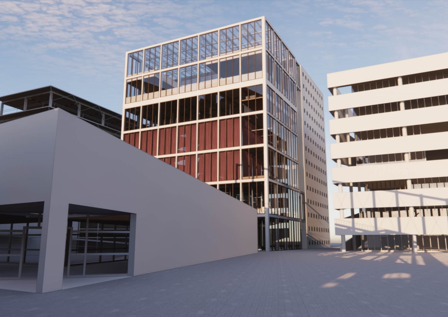
Situating under the context of the United Kingdom, where an ageing population are expected, the hospice demand is also expected to increase as people over 65 are the largest patient group utilizing the service. With this consideration and the intention to minimize hospice’s image of being the land of death, I decided it is best to drag hospice back to the city and have it engaged with the public, resulting in a tower and culture centre-like hospice. 


Campus Masterplan
Campus Masterplan
Hospice Exterior
Hospice Exterior

The universal campus is a collective platform generated internally from ADS5 projects, forming a collaborative campus of our own and sits as a virtual common ground. It is a simplified reflection of the highly fluctuating economy happening today, where program and architecture continually fluctuate throughout the year as our projects developed. It justified the studio approach in designing with intuitions, with programs and context as supporting elements, as such results in a resilient architecture while programs come and go.

However, while anonymous is praised, our designs still react to one another, in space, in height, and in programmatic needs. In my case, my programmatic needs are to be within the campus centre with extrovert facing the crowd and enjoys most of the daylights. And because of my height, it ultimately landed at the corner of the square, satisfying my needs without blocking others daylight.